Introduction
The CometChat v5 Android UI Kit streamlines the integration of in-app chat functionality into your applications. Packed with prebuilt, modular UI components, it supports essential messaging features for both one-to-one and group conversations. With built-in theming options, including light and dark modes, customizable fonts, colors, and extensive configuration possibilities, developers can create chat experiences tailored to their application’s needs.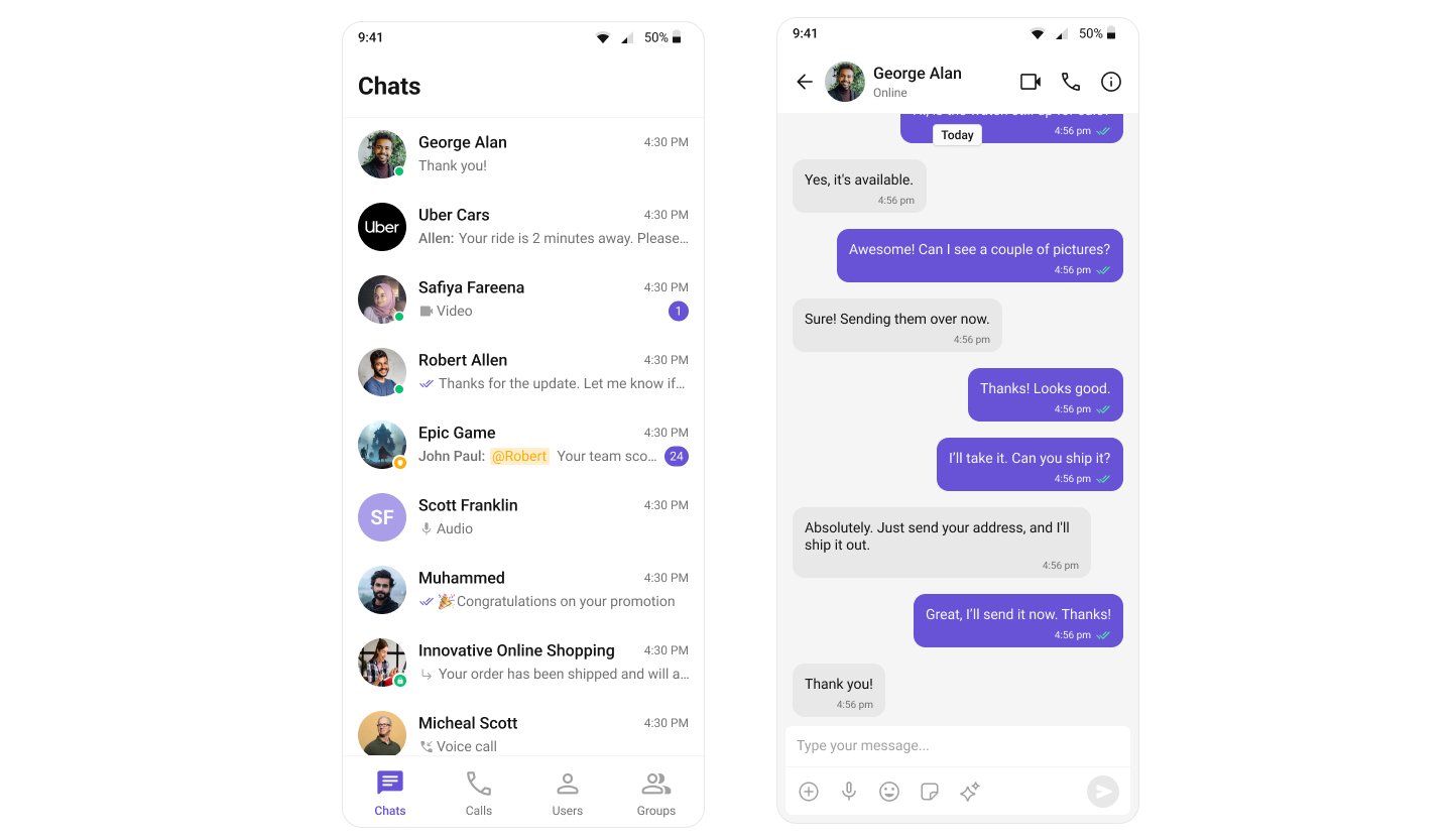
Integration
In v4, integration was straightforward due to the availability of composite components likeCometChatConversationsWithMessages. This single component provided end-to-end functionality, including listing conversations, handling conversation clicks, loading messages (message header, list, composer), displaying user or group details, and supporting threaded messages. Developers could achieve all these features with minimal setup. However, customization posed significant challenges. Customizing the UI or adding custom views required a deep understanding of the internal flow of the composite component. Additionally, configurations were a mix of custom view props, behavioural props, and style props, which often led to confusion. Styling deeply nested components also proved cumbersome, limiting the developer’s ability to make meaningful changes.
Conversations, Message Header, Message List, and Message Composer. This modular approach makes integration more flexible and easier to understand. Each component has a well-defined purpose, allowing developers to use them in ways that suit their specific requirements. The need for complex configurations has been eliminated, as developers can now customize behavior and styling directly via props. Styling has been significantly simplified, with every component carefully assigned, enabling developers to customize styles globally or at the component level effortlessly.
To support the transition from v4 to v5, CometChat has built a sample app that replicates the functionality of v4’s composite components. This sample app serves as a reference for developers looking to build additional features such as user/group details, call log details, threaded messages, and advanced messaging capabilities. By following this approach, developers can take full advantage of v5’s modular design while implementing complex functionality in an organized manner.
Learn how to build a complete messaging UI using the v5 UI Kit by following the step-by-step guide here.
Components
The v4 UI Kit provided composite components likeCometChatConversationsWithMessages, which offered end-to-end functionality. These components integrated features such as conversation lists, message views (header, list, composer), user/group details, and threaded messages into a single unit. However, customization of deeply nested components through configuration was challenging and resulted in a suboptimal developer experience.
| Components in v4 UI Kit: | ||
|---|---|---|
| CometChatConversationsWithMessages | CometChatUsersWithMessages | CometChatGroupsWithMessages |
| CometChatMessages | CometChatMessageHeader | CometChatMessageList |
| CometChatMessageComposer | CometChatThreadedMessages | CometChatConversations |
| CometChatUsers | CometChatGroups | CometChatContacts |
| CometChatDetails | CometChatGroupMembers | CometChatAddMembers |
| CometChatBannedMembers | CometChatTransferOwnership | CometChatMessageInformation |
| CometChatIncomingCall | CometChatOngoingCall | CometChatOutgoingCall |
| CometChatCallButtons | CometChatCallLogs | CometChatCallLogDetails |
| CometChatCallLogHistory | CometChatCallLogRecordings | CometChatCallLogParticipants |
| CometChatCallLogsWithDetails |
Conversations, Message Header, Message List, and Message Composer. Developers now need to stitch these components together to build the desired functionality. This change allows for greater flexibility and easier customization via props, significantly improving the developer experience while maintaining functionality.
| Components in v5 UI Kit: | ||
|---|---|---|
| CometChatConversations | CometChatUsers | CometChatGroups |
| CometChatGroupMembers | CometChatMessageHeader | CometChatMessageList |
| CometChatMessageComposer | CometChatThreadedHeader | CometChatIncomingCall |
| CometChatOutgoingCall | CometChatCallButtons | CometChatCallLogs |
Theming
In v4, theming was managed using thePalette and Typography classes. The Palette class provided methods like background, mode, primary, secondary, and similar setters for configuring colors and themes. While this approach worked, it required instantiating multiple objects and passing them through constructors, which added complexity to the theming process. Developers had to create palette and typography instances, configure them with various color and font settings, and then pass them to create a theme object.
The reliance on Context for theming introduced several challenges. Customizing themes often required developers to consume the theme from the context and then explicitly update values programmatically, which added unnecessary complexity. For example, switching between light and dark modes required interacting with the theme’s context and invoking specific methods like mode. This process was less straightforward compared to the traditional approach to define themes dynamically.
- Java
- Kotlin
themes.xml. This approach leverages Android’s native theming system built on Material Components, specifically using CometChatTheme.DayNight as the parent theme.
The new theming system is declarative, XML-based, and follows Android conventions. Developers now define themes in themes.xml by extending CometChatTheme.DayNight and overriding specific attributes. For example, changing the primary color is as simple as overriding the cometchatPrimaryColor attribute — no need to instantiate objects or write programmatic theming logic.
themes.xml:
- Native Android approach: Uses standard XML theme attributes and Material Components
- Automatic light/dark mode support: Built on
Theme.MaterialComponents.DayNight.NoActionBar, providing seamless theme switching based on system settings - No programmatic complexity: No need to instantiate
PaletteorTypographyobjects - Centralized configuration: All theme properties defined in one place (
themes.xml)
For detailed guidance on theming and customizing colors in the CometChat React UI Kit, refer to the following resources:
- Theming Documentation: Guide to Theming
- Color Customization: Customizing Colors
Properties
In v5, the approach to component properties has been significantly refined to improve clarity and ease of use. All style-related properties have been streamlined to work seamlessly with the new theming system based on direct property access. This change ensures a more efficient and flexible styling process without the need for verbose or redundant configuration within the component properties. Configuration properties, which were prominent in v4, have also been simplified. With v5’s modular design, components are no longer deeply nested, making complex configurations unnecessary. Developers now have direct control over each component through clearly defined properties, reducing complexity and increasing flexibility in how components are used and styled. Custom view properties have undergone a comprehensive overhaul to ensure consistency across all components. For example, components that are represented as list items now share a uniform set of customizable properties, enabling a standardized approach to customization. These properties include:itemView- Custom view for the entire itemleadingView- Custom view for the leading sectiontrailingView- Custom view for the trailing sectionsubtitleView- Custom view for the subtitletitleView- Custom view for the title
Additional Resources
CometChatLocalize Class
View the source code for the localization class.
Language JSON Files
Browse all available language translation files.
Property Changes
Below is a detailed reference of new, updated, and removed properties across all UI Kit components in the V4-to-V5 migration.Conversations
New Properties
| Name | Type | Description |
|---|---|---|
| dateTimeFormatter | DateTimeFormatterCallback | Callback for custom date/time formatting in conversations |
| toolbarVisibility | int | Controls visibility of the toolbar in conversations view |
| deleteConversationOptionVisibility | int | Controls visibility of delete conversation option |
| backIconVisibility | int | Controls visibility of back icon in toolbar |
| userStatusVisibility | int | Controls visibility of user status indicators |
| groupTypeVisibility | int | Controls visibility of group type indicators |
| receiptsVisibility | int | Controls visibility of read receipts |
| errorStateVisibility | int | Controls visibility of error state view |
| loadingStateVisibility | int | Controls visibility of loading state view |
| emptyStateVisibility | int | Controls visibility of empty state view |
| separatorHeight | @Dimension int | Height of separator between conversation items |
| separatorColor | @ColorInt int | Color of separator between conversation items |
| separatorVisibility | int | Controls visibility of separator |
| deleteOptionIcon | Drawable | Icon for delete option in popup menu |
| deleteOptionIconTint | @ColorInt int | Tint color for delete option icon |
| deleteOptionTextColor | @ColorInt int | Text color for delete option |
| deleteOptionTextAppearance | @StyleRes int | Text appearance for delete option |
| discardSelectionIcon | Drawable | Icon for discarding selection |
| discardSelectionIconTint | @ColorInt int | Tint color for discard selection icon |
| submitSelectionIcon | Drawable | Icon for submitting selection |
| submitSelectionIconTint | @ColorInt int | Tint color for submit selection icon |
| checkBoxStrokeWidth | @Dimension int | Stroke width for selection checkboxes |
| checkBoxCornerRadius | @Dimension int | Corner radius for selection checkboxes |
| checkBoxStrokeColor | @ColorInt int | Stroke color for selection checkboxes |
| checkBoxBackgroundColor | @ColorInt int | Background color for selection checkboxes |
| checkBoxCheckedBackgroundColor | @ColorInt int | Background color for checked checkboxes |
| checkBoxSelectIcon | Drawable | Icon for selected checkboxes |
| checkBoxSelectIconTint | @ColorInt int | Tint color for checkbox select icon |
| itemSelectedBackgroundColor | @ColorInt int | Background color for selected items |
| itemBackgroundColor | @ColorInt int | Background color for conversation items |
| optionListStyle | @StyleRes int | Style for popup menu options |
| mentionsStyle | @StyleRes int | Style for mentions in conversations |
| typingIndicatorStyle | @StyleRes int | Style for typing indicators |
| receiptStyle | @StyleRes int | Style for message receipts |
| badgeStyle | @StyleRes int | Style for conversation badges |
| dateStyle | @StyleRes int | Style for conversation dates |
| statusIndicatorStyle | @StyleRes int | Style for status indicators |
| avatarStyle | @StyleRes int | Style for conversation avatars |
| emptyView | @LayoutRes int | Layout resource for empty state |
| errorView | @LayoutRes int | Layout resource for error state |
| loadingView | @LayoutRes int | Layout resource for loading state |
| additionParameter | AdditionParameter | Additional parameters for conversations |
| onBackPress | OnBackPress | Callback for back button press |
| addOptions | Function2< Context, Conversation, List< CometChatPopupMenu.MenuItem >> | Function to add options to popup menu |
| options | Function2< Context, Conversation, List< CometChatPopupMenu.MenuItem >> | Function to replace popup menu options |
| overflowMenu | View | Custom overflow menu view |
| onLoad | OnLoad< Conversation > | Callback when conversations are loaded |
| onEmpty | OnEmpty | Callback when conversation list is empty |
| onSelection | OnSelection< Conversation > | Callback for conversation selection |
| onItemClick | OnItemClick< Conversation > | Callback for conversation item clicks |
| onItemLongClick | OnItemLongClick< Conversation > | Callback for conversation item long clicks |
Renamed Properties
| V4 Name | V5 Name | Type | Description |
|---|---|---|---|
| setItemClickListener | setOnItemClick | Method | Sets click listener for conversation items |
| setOnSelection | setOnSelect | Method | Sets selection listener for conversations |
| setSubtitle | setSubtitleView | Method | Sets custom subtitle view |
| setTailView | setTrailingView | Method | Sets custom trailing view |
| setListItemView | setItemView | Method | Sets custom item view |
| setDatePattern | setDateTimeFormatter | Method | Sets date formatting for conversations |
Removed Properties
| Name | Type | Description |
|---|---|---|
| hideError | boolean | Flag to hide error messages |
| errorText | String | Custom error message text |
| errorStateTextAppearance | int | Text appearance for error state |
| errorMessageColor | int | Color for error messages |
| palette | Palette | Color palette instance |
| typography | Typography | Typography instance |
| swipeHelper | RecyclerViewSwipeListener | Swipe gesture helper |
| progressDialog | ProgressDialog | Progress dialog for operations |
| conversationTemp | Conversation | Temporary conversation reference |
| loadingIcon | ImageView | Loading icon view |
| disableMentions | boolean | Flag to disable mentions |
| cometChatMentionsFormatter | CometChatMentionsFormatter | Mentions formatter instance |
| setStyle(ConversationsStyle) | Method | Sets conversation style using ConversationsStyle object |
| emptyStateText | Method | Sets empty state text |
| emptyStateTextColor | Method | Sets empty state text color |
| emptyStateTextFont | Method | Sets empty state text font |
| emptyStateTextAppearance | Method | Sets empty state text appearance |
| errorStateTextAppearance | Method | Sets error state text appearance |
| errorStateTextColor | Method | Sets error state text color |
| errorStateText | Method | Sets error state text |
| setEmptyStateView | Method | Sets empty state view |
| setErrorStateView | Method | Sets error state view |
| setLoadingStateView | Method | Sets loading state view |
| setLoadingIconTintColor | Method | Sets loading icon tint |
| disableUsersPresence | Method | Disables user presence |
| disableReceipt | Method | Disables receipts |
| hideReceipt | Method | Hides receipts |
| disableTyping | Method | Disables typing indicators |
| setProtectedGroupIcon | Method | Sets protected group icon |
| setPrivateGroupIcon | Method | Sets private group icon |
| setReadIcon | Method | Sets read status icon |
| setDeliveredIcon | Method | Sets delivered status icon |
| setSentIcon | Method | Sets sent status icon |
| hideSeparator | Method | Hides item separators |
Users
New Properties
| Name | Type | Description |
|---|---|---|
| toolbarVisibility | int | Controls visibility of the toolbar in users view |
| loadingStateVisibility | int | Controls visibility of loading state view |
| searchBoxVisibility | int | Controls visibility of search box |
| backIconVisibility | int | Controls visibility of back icon in toolbar |
| stickyHeaderVisibility | int | Controls visibility of sticky header |
| emptyStateVisibility | int | Controls visibility of empty state view |
| errorStateVisibility | int | Controls visibility of error state view |
| separatorVisibility | int | Controls visibility of separator between items |
| titleVisibility | int | Controls visibility of title |
| userStatusVisibility | int | Controls visibility of user status indicators |
| showShimmer | boolean | Flag to control shimmer loading animation |
| isUserListEmpty | boolean | Flag indicating if user list is empty |
| isFurtherSelectionEnabled | boolean | Flag to control further selection capability |
| searchPlaceholderText | String | Placeholder text for search input |
| customLoadingView | View | Custom view for loading state |
| overflowMenu | View | Custom overflow menu view |
| onLoad | OnLoad< User > | Callback when users are loaded |
| onEmpty | OnEmpty | Callback when user list is empty |
| onBackPress | OnBackPress | Callback for back button press |
| backgroundColor | @ColorInt int | Background color for the view |
| titleTextColor | @ColorInt int | Text color for title |
| titleTextAppearance | @StyleRes int | Text appearance for title |
| strokeWidth | @Dimension int | Stroke width for card border |
| strokeColor | @ColorInt int | Stroke color for card border |
| cornerRadius | @Dimension int | Corner radius for card |
| backIcon | Drawable | Back icon drawable |
| backIconTint | @ColorInt int | Tint color for back icon |
| separatorColor | @ColorInt int | Color of separator between items |
| discardSelectionIcon | Drawable | Icon for discarding selection |
| discardSelectionIconTint | @ColorInt int | Tint color for discard selection icon |
| submitSelectionIcon | Drawable | Icon for submitting selection |
| submitSelectionIconTint | @ColorInt int | Tint color for submit selection icon |
| searchInputEndIcon | Drawable | End icon for search input |
| searchInputEndIconTint | @ColorInt int | Tint color for search input end icon |
| searchInputStrokeWidth | @Dimension int | Stroke width for search input |
| searchInputStrokeColor | @ColorInt int | Stroke color for search input |
| searchInputCornerRadius | @Dimension int | Corner radius for search input |
| searchInputBackgroundColor | @ColorInt int | Background color for search input |
| searchInputTextAppearance | @StyleRes int | Text appearance for search input |
| searchInputTextColor | @ColorInt int | Text color for search input |
| searchInputPlaceHolderTextAppearance | @StyleRes int | Placeholder text appearance for search input |
| searchInputPlaceHolderTextColor | @ColorInt int | Placeholder text color for search input |
| searchInputIconTint | @ColorInt int | Tint color for search input icon |
| searchInputIcon | Drawable | Icon for search input |
| stickyTitleColor | @ColorInt int | Color for sticky title |
| stickyTitleAppearance | @StyleRes int | Text appearance for sticky title |
| stickyTitleBackgroundColor | @ColorInt int | Background color for sticky title |
| avatar | @StyleRes int | Style resource for avatar |
| itemTitleTextAppearance | @StyleRes int | Text appearance for item title |
| itemTitleTextColor | @ColorInt int | Text color for item title |
| itemBackgroundColor | @ColorInt int | Background color for items |
| statusIndicatorStyle | @StyleRes int | Style for status indicators |
| itemSelectedBackgroundColor | @ColorInt int | Background color for selected items |
| checkBoxStrokeWidth | @Dimension int | Stroke width for selection checkboxes |
| checkBoxCornerRadius | @Dimension int | Corner radius for selection checkboxes |
| checkBoxStrokeColor | @ColorInt int | Stroke color for selection checkboxes |
| checkBoxBackgroundColor | @ColorInt int | Background color for selection checkboxes |
| checkBoxCheckedBackgroundColor | @ColorInt int | Background color for checked checkboxes |
| checkBoxSelectIconTint | @ColorInt int | Tint color for checkbox select icon |
| checkBoxSelectIcon | Drawable | Icon for selected checkboxes |
| emptyStateTextAppearance | @StyleRes int | Text appearance for empty state |
| emptyStateTextColor | @ColorInt int | Text color for empty state |
| emptyStateSubTitleTextAppearance | @StyleRes int | Subtitle text appearance for empty state |
| emptyStateSubtitleTextColor | @ColorInt int | Subtitle text color for empty state |
| errorStateTextAppearance | @StyleRes int | Text appearance for error state |
| errorStateTextColor | @ColorInt int | Text color for error state |
| errorStateSubtitleTextAppearance | @StyleRes int | Subtitle text appearance for error state |
| errorStateSubtitleColor | @ColorInt int | Subtitle text color for error state |
| retryButtonTextColor | @ColorInt int | Text color for retry button |
| retryButtonTextAppearance | @StyleRes int | Text appearance for retry button |
| retryButtonBackgroundColor | @ColorInt int | Background color for retry button |
| retryButtonStrokeColor | @ColorInt int | Stroke color for retry button |
| retryButtonStrokeWidth | @Dimension int | Stroke width for retry button |
| retryButtonCornerRadius | @Dimension int | Corner radius for retry button |
| emptyViewId | @LayoutRes int | Layout resource for empty view |
| errorViewId | @LayoutRes int | Layout resource for error view |
| loadingViewId | @LayoutRes int | Layout resource for loading view |
| submitSelectionIconVisibility | int | Controls visibility of submit selection icon |
| addOptions | Function2< Context, User, List< CometChatPopupMenu.MenuItem >> | Function to add options to popup menu |
| options | Function2< Context, User, List< CometChatPopupMenu.MenuItem >> | Function to replace popup menu options |
| cometchatPopUpMenu | CometChatPopupMenu | Popup menu for user actions |
Renamed Properties
| V4 Name | V5 Name | Type | Description |
|---|---|---|---|
| setItemClickListener | setOnItemClick | Method | Sets click listener for user items |
| setOnSelection | setOnSelect | Method | Sets selection listener for users |
| setSubtitle | setSubtitleView | Method | Sets custom subtitle view |
| setTail | setTailView | Method | Sets custom tail view (renamed to setTrailingView) |
| setListItemView | setItemView | Method | Sets custom item view |
| getConversationsAdapter | getUsersAdapter | Method | Gets the users adapter |
Removed Properties
| Name | Type | Description |
|---|---|---|
| hideError | boolean | Flag to hide error messages |
| emptyStateText | TextView | TextView for empty state message |
| errorStateTextAppearance | int | Text appearance for error state |
| errorMessageColor | int | Color for error messages |
| errorText | String | Custom error message text |
| palette | Palette | Color palette instance |
| typography | Typography | Typography instance |
| swipeHelper | RecyclerViewSwipeListener | Swipe gesture helper |
| loadingIcon | ImageView | Loading icon view |
| submitIcon | @DrawableRes int | Submit icon resource |
| icon | ImageView | Icon view for submit |
| setStyle(UsersStyle) | Method | Sets users style using UsersStyle object |
| emptyStateText(String) | Method | Sets empty state text |
| emptyStateTextColor(int) | Method | Sets empty state text color |
| emptyStateTextFont(String) | Method | Sets empty state text font |
| emptyStateTextAppearance(int) | Method | Sets empty state text appearance |
| errorStateTextAppearance(int) | Method | Sets error state text appearance |
| errorStateTextColor(int) | Method | Sets error state text color |
| errorStateText(String) | Method | Sets error state text |
| setEmptyStateView(@LayoutRes int) | Method | Sets empty state view layout |
| setLoadingIconTintColor(@ColorInt int) | Method | Sets loading icon tint color |
| setErrorStateView(@LayoutRes int) | Method | Sets error state view layout |
| setLoadingStateView(@LayoutRes int) | Method | Sets loading state view layout |
| setBackground(int[], GradientDrawable.Orientation) | Method | Sets gradient background |
| disableUsersPresence(boolean) | Method | Disables user presence indicators |
| setSubmitIcon(@DrawableRes int) | Method | Sets submit icon |
| setSelectionIcon(@DrawableRes int) | Method | Sets selection icon |
| setFurtherSelectionEnabled(boolean) | Method | Sets further selection capability |
| hideError(boolean) | Method | Hides error messages |
| hideSeparator(boolean) | Method | Hides separators (replaced with setStickyHeaderVisibility) |
Groups
New Properties
| Name | Type | Description |
|---|---|---|
| showShimmer | boolean | Flag to control shimmer loading animation |
| isGroupListEmpty | boolean | Flag indicating if group list is empty |
| isFurtherSelectionEnabled | boolean | Flag to control further selection capability |
| searchPlaceholderText | String | Placeholder text for search input |
| customEmptyView | View | Custom view for empty state |
| customErrorView | View | Custom view for error state |
| customLoadingView | View | Custom view for loading state |
| overflowMenu | View | Custom overflow menu view |
| onLoad | OnLoad< Group > | Callback when groups are loaded |
| onEmpty | OnEmpty | Callback when group list is empty |
| onBackPress | OnBackPress | Callback for back button press |
| backgroundColor | @ColorInt int | Background color for the view |
| titleTextColor | @ColorInt int | Text color for title |
| titleTextAppearance | @StyleRes int | Text appearance for title |
| strokeWidth | @Dimension int | Stroke width for card border |
| strokeColor | @ColorInt int | Stroke color for card border |
| cornerRadius | @Dimension int | Corner radius for card |
| backIcon | Drawable | Back icon drawable |
| backIconTint | @ColorInt int | Tint color for back icon |
| separatorColor | @ColorInt int | Color of separator between items |
| discardSelectionIcon | Drawable | Icon for discarding selection |
| discardSelectionIconTint | @ColorInt int | Tint color for discard selection icon |
| submitSelectionIcon | Drawable | Icon for submitting selection |
| submitSelectionIconTint | @ColorInt int | Tint color for submit selection icon |
| subtitleTextAppearance | @StyleRes int | Text appearance for subtitle |
| subtitleTextColor | @ColorInt int | Text color for subtitle |
| searchInputEndIcon | Drawable | End icon for search input |
| searchInputEndIconTint | @ColorInt int | Tint color for search input end icon |
| searchInputStrokeWidth | @Dimension int | Stroke width for search input |
| searchInputStrokeColor | @ColorInt int | Stroke color for search input |
| searchInputCornerRadius | @Dimension int | Corner radius for search input |
| searchInputBackgroundColor | @ColorInt int | Background color for search input |
| searchInputTextAppearance | @StyleRes int | Text appearance for search input |
| searchInputTextColor | @ColorInt int | Text color for search input |
| searchInputPlaceHolderTextAppearance | @StyleRes int | Placeholder text appearance for search input |
| searchInputPlaceHolderTextColor | @ColorInt int | Placeholder text color for search input |
| searchInputIconTint | @ColorInt int | Tint color for search input icon |
| searchInputIcon | Drawable | Icon for search input |
| avatar | @StyleRes int | Style resource for avatar |
| itemTitleTextAppearance | @StyleRes int | Text appearance for item title |
| itemTitleTextColor | @ColorInt int | Text color for item title |
| itemBackgroundColor | @ColorInt int | Background color for items |
| statusIndicatorStyle | @StyleRes int | Style for status indicators |
| itemSelectedBackgroundColor | @ColorInt int | Background color for selected items |
| checkBoxStrokeWidth | @Dimension int | Stroke width for selection checkboxes |
| checkBoxCornerRadius | @Dimension int | Corner radius for selection checkboxes |
| checkBoxStrokeColor | @ColorInt int | Stroke color for selection checkboxes |
| checkBoxBackgroundColor | @ColorInt int | Background color for selection checkboxes |
| checkBoxCheckedBackgroundColor | @ColorInt int | Background color for checked checkboxes |
| checkBoxSelectIconTint | @ColorInt int | Tint color for checkbox select icon |
| checkBoxSelectIcon | Drawable | Icon for selected checkboxes |
| emptyStateTextAppearance | @StyleRes int | Text appearance for empty state |
| emptyStateTextColor | @ColorInt int | Text color for empty state |
| emptyStateSubTitleTextAppearance | @StyleRes int | Subtitle text appearance for empty state |
| emptyStateSubtitleTextColor | @ColorInt int | Subtitle text color for empty state |
| errorStateTextAppearance | @StyleRes int | Text appearance for error state |
| errorStateTextColor | @ColorInt int | Text color for error state |
| errorStateSubtitleTextAppearance | @StyleRes int | Subtitle text appearance for error state |
| errorStateSubtitleColor | @ColorInt int | Subtitle text color for error state |
| retryButtonTextColor | @ColorInt int | Text color for retry button |
| retryButtonTextAppearance | @StyleRes int | Text appearance for retry button |
| retryButtonBackgroundColor | @ColorInt int | Background color for retry button |
| retryButtonStrokeColor | @ColorInt int | Stroke color for retry button |
| retryButtonStrokeWidth | @Dimension int | Stroke width for retry button |
| retryButtonCornerRadius | @Dimension int | Corner radius for retry button |
| loadingViewId | @LayoutRes int | Layout resource for loading view |
| emptyViewId | @LayoutRes int | Layout resource for empty view |
| errorViewId | @LayoutRes int | Layout resource for error view |
| toolbarVisibility | int | Controls visibility of toolbar |
| searchBoxVisibility | int | Controls visibility of search box |
| backIconVisibility | int | Controls visibility of back icon |
| emptyStateVisibility | int | Controls visibility of empty state view |
| loadingStateVisibility | int | Controls visibility of loading state view |
| errorStateVisibility | int | Controls visibility of error state view |
| groupTypeVisibility | int | Controls visibility of group type indicators |
| separatorVisibility | int | Controls visibility of separator |
| titleVisibility | int | Controls visibility of title |
| addOptions | Function2< Context, Group, List< CometChatPopupMenu.MenuItem >> | Function to add options to popup menu |
| options | Function2< Context, Group, List< CometChatPopupMenu.MenuItem >> | Function to replace popup menu options |
| cometchatPopUpMenu | CometChatPopupMenu | Popup menu for group actions |
Renamed Properties
| V4 Name | V5 Name | Type | Description |
|---|---|---|---|
| setItemClickListener | setOnItemClick | Method | Sets click listener for group items |
| setOnSelection | setOnSelection | Method | Sets selection listener for groups (signature changed) |
| setSubtitle | setSubtitleView | Method | Sets custom subtitle view |
| setTail | setTailView | Method | Sets custom tail view (renamed to setTrailingView) |
| setListItemView | setItemView | Method | Sets custom item view |
| getAdapter | getAdapter | Method | Gets the groups adapter (return type changed) |
| setPasswordGroupIcon | N/A | Method | Method for password group icon (removed) |
Removed Properties
| Name | Type | Description |
|---|---|---|
| hideError | boolean | Flag to hide error messages |
| emptyStateText | TextView | TextView for empty state message |
| errorStateTextAppearance | int | Text appearance for error state (moved to styled attributes) |
| errorMessageColor | int | Color for error messages |
| errorText | String | Custom error message text |
| palette | Palette | Color palette instance |
| typography | Typography | Typography instance |
| swipeHelper | RecyclerViewSwipeListener | Swipe gesture helper |
| icon | ImageView | Icon view for submit |
| submitIcon | @DrawableRes int | Submit icon resource |
| loadingIcon | ImageView | Loading icon view |
| setStyle(GroupsStyle) | Method | Sets groups style using GroupsStyle object |
| emptyStateText(String) | Method | Sets empty state text |
| emptyStateTextColor(int) | Method | Sets empty state text color |
| emptyStateTextFont(String) | Method | Sets empty state text font |
| emptyStateTextAppearance(int) | Method | Sets empty state text appearance |
| errorStateTextAppearance(int) | Method | Sets error state text appearance |
| errorStateTextColor(int) | Method | Sets error state text color |
| errorStateText(String) | Method | Sets error state text |
| setEmptyStateView(@LayoutRes int) | Method | Sets empty state view layout |
| setLoadingIconTintColor(@ColorInt int) | Method | Sets loading icon tint color |
| setErrorStateView(@LayoutRes int) | Method | Sets error state view layout |
| setLoadingStateView(@LayoutRes int) | Method | Sets loading state view layout |
| setBackground(int[], GradientDrawable.Orientation) | Method | Sets gradient background |
| setSubmitIcon(@DrawableRes int) | Method | Sets submit icon |
| hideError(boolean) | Method | Hides error messages |
| hideSeparator(boolean) | Method | Hides separators (replaced with visibility controls) |
| setOverflowMenuOptions | Method | Sets overflow menu options (replaced with setOptions) |
| showError() | Method | Shows error state |
| getOption(Group, List< UnderlayButton >) | Method | Gets swipe options |
GroupMembers
New Properties
| Name | Type | Description |
|---|---|---|
| deleteAlertDialog | CometChatConfirmDialog | Dialog for confirming member deletion actions |
| customEmptyStateView | View | Custom view for empty state |
| customErrorStateView | View | Custom view for error state |
| customLoadingView | View | Custom view for loading state |
| onLoad | OnLoad< GroupMember > | Callback when group members are loaded |
| onEmpty | OnEmpty | Callback when group member list is empty |
| userStatusVisibility | int | Controls visibility of user status indicators |
| toolbarVisibility | int | Controls visibility of toolbar |
| searchBoxVisibility | int | Controls visibility of search box |
| kickMemberOptionVisibility | int | Controls visibility of kick member option |
| banMemberOptionVisibility | int | Controls visibility of ban member option |
| scopeChangeOptionVisibility | int | Controls visibility of scope change option |
| emptyStateVisibility | int | Controls visibility of empty state view |
| loadingStateVisibility | int | Controls visibility of loading state view |
| errorStateVisibility | int | Controls visibility of error state view |
| addOptions | Function3< Context, GroupMember, Group, List< CometChatPopupMenu.MenuItem >> | Function to add options to popup menu |
| cometchatPopUpMenu | CometChatPopupMenu | Popup menu for member actions |
| searchInputStrokeColor | @ColorInt int | Stroke color for search input |
| searchInputBackgroundColor | @ColorInt int | Background color for search input |
| searchInputTextColor | @ColorInt int | Text color for search input |
| searchInputPlaceHolderTextColor | @ColorInt int | Placeholder text color for search input |
| backIconTint | @ColorInt int | Tint color for back icon |
| strokeColor | @ColorInt int | Stroke color for card border |
| backgroundColor | @ColorInt int | Background color for the view |
| titleTextColor | @ColorInt int | Text color for title |
| emptyStateTitleTextColor | @ColorInt int | Text color for empty state title |
| emptyStateSubtitleTextColor | @ColorInt int | Text color for empty state subtitle |
| errorStateTitleTextColor | @ColorInt int | Text color for error state title |
| errorStateSubtitleTextColor | @ColorInt int | Text color for error state subtitle |
| itemTitleTextColor | @ColorInt int | Text color for item title |
| separatorColor | @ColorInt int | Color of separator between items |
| strokeWidth | @Dimension int | Stroke width for card border |
| cornerRadius | @Dimension int | Corner radius for card |
| separatorHeight | @Dimension int | Height of separator between items |
| searchInputStrokeWidth | @Dimension int | Stroke width for search input |
| searchInputCornerRadius | @Dimension int | Corner radius for search input |
| checkBoxStrokeWidth | @Dimension int | Stroke width for selection checkboxes |
| checkBoxCornerRadius | @Dimension int | Corner radius for selection checkboxes |
| searchInputTextAppearance | @StyleRes int | Text appearance for search input |
| titleTextAppearance | @StyleRes int | Text appearance for title |
| emptyStateTitleTextAppearance | @StyleRes int | Text appearance for empty state title |
| emptyStateSubtitleTextAppearance | @StyleRes int | Text appearance for empty state subtitle |
| errorStateTitleTextAppearance | @StyleRes int | Text appearance for error state title |
| errorStateSubtitleTextAppearance | @StyleRes int | Text appearance for error state subtitle |
| itemTitleTextAppearance | @StyleRes int | Text appearance for item title |
| avatarStyle | @StyleRes int | Style resource for avatar |
| statusIndicatorStyle | @StyleRes int | Style resource for status indicator |
| style | @StyleRes int | Overall style resource |
| discardSelectionIcon | Drawable | Icon for discarding selection |
| discardSelectionIconTint | @ColorInt int | Tint color for discard selection icon |
| submitSelectionIcon | Drawable | Icon for submitting selection |
| submitSelectionIconTint | @ColorInt int | Tint color for submit selection icon |
| searchInputStartIcon | Drawable | Start icon for search input |
| searchInputEndIcon | Drawable | End icon for search input |
| searchInputStartIconTint | @ColorInt int | Tint color for search input start icon |
| searchInputEndIconTint | @ColorInt int | Tint color for search input end icon |
| backIcon | Drawable | Back icon drawable |
| backgroundDrawable | Drawable | Background drawable |
| selectIcon | Drawable | Selection icon drawable |
| selectIconTint | @ColorInt int | Tint color for selection icon |
| checkBoxStrokeColor | @ColorInt int | Stroke color for selection checkboxes |
| checkBoxBackgroundColor | @ColorInt int | Background color for selection checkboxes |
| checkBoxCheckedBackgroundColor | @ColorInt int | Background color for checked checkboxes |
| emptyViewId | @LayoutRes int | Layout resource for empty view |
| errorViewId | @LayoutRes int | Layout resource for error view |
| loadingViewId | @LayoutRes int | Layout resource for loading view |
| overflowMenu | View | Custom overflow menu view |
Renamed Properties
| V4 Name | V5 Name | Type | Description |
|---|---|---|---|
| setItemClickListener | setOnItemClick | Method | Sets click listener for group member items |
| setOnSelection | setOnSelection | Method | Sets selection listener (signature changed) |
| setSubtitleView | setSubtitleView | Method | Sets custom subtitle view (signature changed) |
| setTailView | setTrailingView | Method | Sets custom trailing view |
| setListItemView | setItemView | Method | Sets custom item view |
| getConversationsAdapter | getAdapter | Method | Gets the group members adapter |
| disableUsersPresence | setUserStatusVisibility | Method | Controls user presence visibility |
Removed Properties
| Name | Type | Description |
|---|---|---|
| hideError | boolean | Flag to hide error messages |
| emptyStateText | TextView | TextView for empty state message |
| errorStateTextAppearance | int | Text appearance for error state (moved to styled attributes) |
| errorMessageColor | int | Color for error messages |
| errorText | String | Custom error message text |
| palette | Palette | Color palette instance |
| typography | Typography | Typography instance |
| swipeHelper | RecyclerViewSwipeListener | Swipe gesture helper |
| loadingIcon | ImageView | Loading icon view |
| submitIcon | @DrawableRes int | Submit icon resource |
| icon | ImageView | Icon view for submit |
| setStyle(GroupMembersStyle) | Method | Sets group members style using GroupMembersStyle object |
| emptyStateText(String) | Method | Sets empty state text |
| emptyStateTextColor(int) | Method | Sets empty state text color |
| emptyStateTextFont(String) | Method | Sets empty state text font |
| emptyStateTextAppearance(int) | Method | Sets empty state text appearance |
| errorStateTextAppearance(int) | Method | Sets error state text appearance |
| errorStateTextColor(int) | Method | Sets error state text color |
| errorStateText(String) | Method | Sets error state text |
| setEmptyStateView(@LayoutRes int) | Method | Sets empty state view layout (renamed to setEmptyView) |
| setLoadingIconTintColor(@ColorInt int) | Method | Sets loading icon tint color |
| setErrorStateView(@LayoutRes int) | Method | Sets error state view layout (renamed to setErrorView) |
| setLoadingStateView(@LayoutRes int) | Method | Sets loading state view layout (renamed to setLoadingView) |
| setBackground(int[], GradientDrawable.Orientation) | Method | Sets gradient background |
| setSubmitIcon(@DrawableRes int) | Method | Sets submit icon |
| setSelectionIcon(@DrawableRes int) | Method | Sets selection icon (replaced with setSelectIcon) |
| hideError(boolean) | Method | Hides error messages |
| hideSeparator(boolean) | Method | Hides separators (replaced with visibility controls) |
| showError() | Method | Shows error state |
| getOption(GroupMember, Group, List< UnderlayButton >) | Method | Gets swipe options |
MessageHeader
New Properties
| Name | Type | Description |
|---|---|---|
| backButtonView | View | Custom view for the back button |
| onBackPress | OnBackPress | Callback for back button press events |
| trailingView | Function3< Context, User, Group, View > | Function to create custom trailing view |
| auxiliaryButtonView | Function3< Context, User, Group, View > | Function to create auxiliary button view |
| titleView | Function3< Context, User, Group, View > | Function to create custom title view |
| leadingView | Function3< Context, User, Group, View > | Function to create custom leading view |
| itemView | Function3< Context, User, Group, View > | Function to create custom item view |
| customLastSeenText | Function2< Context, User, String > | Function to customize last seen text |
| titleTextColor | @ColorInt int | Text color for the title |
| subtitleTextColor | @ColorInt int | Text color for the subtitle |
| backIconTint | @ColorInt int | Tint color for the back icon |
| backgroundColor | @ColorInt int | Background color for the header |
| strokeColor | @ColorInt int | Stroke color for the card border |
| cornerRadius | @Dimension int | Corner radius for the card |
| strokeWidth | @Dimension int | Stroke width for the card border |
| titleTextAppearance | @StyleRes int | Text appearance style for the title |
| subtitleTextAppearance | @StyleRes int | Text appearance style for the subtitle |
| avatarStyle | @StyleRes int | Style resource for the avatar |
| statusIndicatorStyle | @StyleRes int | Style resource for status indicator |
| typingIndicatorStyle | @StyleRes int | Style resource for typing indicator |
| callButtonsStyle | @StyleRes int | Style resource for call buttons |
| backIcon | Drawable | Drawable for the back icon |
| additionParameter | AdditionParameter | Additional parameters for configuration |
| onError | OnError | Callback for error handling |
| backButtonVisibility | int | Controls visibility of back button |
| userStatusVisibility | int | Controls visibility of user status |
| groupStatusVisibility | int | Controls visibility of group status |
| videoCallButtonVisibility | int | Controls visibility of video call button |
| voiceCallButtonVisibility | int | Controls visibility of voice call button |
| dateTimeFormatter | DateTimeFormatterCallback | Custom date/time formatter |
Renamed Properties
| V4 Name | V5 Name | Type | Description |
|---|---|---|---|
| subtitle | subtitleView | Function3< Context, User, Group, View > | Function to create custom subtitle view |
| menu | trailingView | Function3< Context, User, Group, View > | Function to create custom menu/trailing view |
| setMenu | setTrailingView | Method | Sets custom trailing view |
| setSubtitleView | setSubtitleView | Method | Sets custom subtitle view (signature changed) |
| disableUsersPresence | setUserStatusVisibility | Method | Controls user presence visibility |
| hideStatusIndicator | setUserStatusVisibility | Method | Controls status indicator visibility |
| setOnBackButtonPressed | setOnBackPress | Method | Sets back button callback |
Removed Properties
| Name | Type | Description |
|---|---|---|
| palette | Palette | Color palette instance |
| typography | Typography | Typography instance |
| toolbar | Toolbar | Toolbar component |
| listItem | CometChatListItem | List item component |
| layout | LinearLayout | Layout container |
| disableTyping | boolean | Flag to disable typing indicator |
| disableUsersPresence | boolean | Flag to disable user presence |
| protectedGroupIcon | @DrawableRes int | Icon for protected groups |
| privateGroupIcon | @DrawableRes int | Icon for private groups |
| onlineStatusColor | @ColorInt int | Color for online status |
| backIcon | ImageView | Back icon view (replaced with Drawable) |
| subtitleView | SubtitleView | Subtitle view component |
| offlineSubtitleTextColor | @ColorInt int | Text color for offline subtitle |
| onlineSubtitleTextColor | @ColorInt int | Text color for online subtitle |
| memberCountSubtitleTextColor | @ColorInt int | Text color for member count subtitle |
| typingIndicatorColor | @ColorInt int | Color for typing indicator |
| listItemStyle | ListItemStyle | Style for list item |
| subtitleTextFont | String | Font for subtitle text |
| typingIndicatorTextFont | String | Font for typing indicator text |
| titleTextFont | String | Font for title text |
| typingIndicatorTextAppearance | int | Text appearance for typing indicator |
| setStyle(MessageHeaderStyle) | Method | Sets header style using MessageHeaderStyle object |
| setProtectedGroupIcon(@DrawableRes int) | Method | Sets protected group icon |
| setPrivateGroupIcon(@DrawableRes int) | Method | Sets private group icon |
| setOnlineStatusColor(int) | Method | Sets online status color |
| setSubtitleTextColor(int) | Method | Sets subtitle text color (replaced with styled approach) |
| setSubtitleTextFont(String) | Method | Sets subtitle text font |
| setTitleTextColor(int) | Method | Sets title text color (replaced with styled approach) |
| setTitleTextFont(String) | Method | Sets title text font |
| setTypingIndicatorFont(String) | Method | Sets typing indicator font |
| setTypingIndicatorTextAppearance(int) | Method | Sets typing indicator text appearance |
| setTypingIndicatorColor(int) | Method | Sets typing indicator color |
| setAvatarStyle(AvatarStyle) | Method | Sets avatar style using AvatarStyle object |
| setStatusIndicatorStyle(StatusIndicatorStyle) | Method | Sets status indicator style using StatusIndicatorStyle object |
| setListItemStyle(ListItemStyle) | Method | Sets list item style using ListItemStyle object |
| setListItemView(View) | Method | Sets list item view (replaced with setItemView) |
| hideBackIcon(boolean) | Method | Hides back icon (replaced with visibility control) |
| getSubtitle(User, Group) | Method | Gets subtitle view |
| getMenu(User, Group) | Method | Gets menu view |
| disableTyping(boolean) | Method | Disables typing indicator |
MessageList
New Properties
| Name | Type | Description |
|---|---|---|
| enableConversationStarter | boolean | Flag to enable AI conversation starter feature |
| enableSmartReplies | boolean | Flag to enable AI smart replies feature |
| replyInThreadOptionVisibility | int | Controls visibility of reply in thread option |
| translateMessageOptionVisibility | int | Controls visibility of translate message option |
| copyMessageOptionVisibility | int | Controls visibility of copy message option |
| editMessageOptionVisibility | int | Controls visibility of edit message option |
| shareMessageOptionVisibility | int | Controls visibility of share message option |
| messagePrivatelyOptionVisibility | int | Controls visibility of message privately option |
| deleteMessageOptionVisibility | int | Controls visibility of delete message option |
| messageInfoOptionVisibility | int | Controls visibility of message info option |
| groupActionMessageVisibility | int | Controls visibility of group action messages |
| messageReactionOptionVisibility | int | Controls visibility of message reaction options |
| avatarVisibility | int | Controls visibility of avatars in messages |
| receiptsVisibility | int | Controls visibility of read receipts |
| badge | CometChatBadge | Badge component for new message indicator |
| customEmptyView | View | Custom view for empty state |
| customErrorView | View | Custom view for error state |
| customLoadingView | View | Custom view for loading state |
| errorStateVisibility | int | Controls visibility of error state |
| incomingMessageBubbleStyle | @StyleRes int | Style resource for incoming message bubbles |
| outgoingMessageBubbleStyle | @StyleRes int | Style resource for outgoing message bubbles |
| dateSeparatorStyle | @StyleRes int | Style resource for date separators |
| deleteDialogStyle | @StyleRes int | Style resource for delete confirmation dialog |
| messageInformationStyle | @StyleRes int | Style resource for message information |
| messageOptionSheetStyle | @StyleRes int | Style resource for message option sheet |
| reactionListStyle | @StyleRes int | Style resource for reaction list |
| smartRepliesStyle | @StyleRes int | Style resource for AI smart replies |
| conversationStarterStyle | @StyleRes int | Style resource for conversation starter |
| dateTimeFormatter | DateTimeFormatterCallback | Callback for custom date/time formatting |
| onLoad | OnLoad< BaseMessage > | Callback when messages are loaded |
| onEmpty | OnEmpty | Callback when message list is empty |
Renamed Properties
| V4 Name | V5 Name | Type | Description |
|---|---|---|---|
| setAlignment | setMessageAlignment | Method | Sets alignment of messages |
| showAvatar | setAvatarVisibility | Method | Controls avatar visibility |
| hideReceipt | setReceiptsVisibility | Method | Controls receipt visibility |
| setDatePattern | setTimeFormat | Method | Sets time format for messages |
| setDateSeparatorPattern | setDateFormat | Method | Sets date format for separators |
| hideError | setErrorStateVisibility | Method | Controls error state visibility |
| setParentMessage | setParentMessage | Method | Sets parent message (parameter type changed from int to long) |
| getMessageAdapter | getAdapter | Method | Gets message adapter |
| setMessageAdapter | setAdapter | Method | Sets message adapter |
Removed Properties
| Name | Type | Description |
|---|---|---|
| errorStateText | String | Text for error state messages |
| newMessageIndicatorText | String | Text for new message indicator |
| cometChatActionSheet | CometChatActionSheet | Action sheet component (replaced) |
| actionSheetStyle | ActionSheetStyle | Style for action sheet (replaced) |
| newMessageLayoutText | TextView | Text view for new message layout (replaced with badge) |
| actionSheetMode | String | Mode for action sheet layout (removed) |
| palette | Palette | Color palette instance (removed) |
| typography | Typography | Typography instance (removed) |
| hideError | boolean | Flag to hide errors (replaced with visibility control) |
| templateBubbleStyle | MessageBubbleStyle | Template bubble style (removed) |
| disableReactions | boolean | Flag to disable reactions (removed) |
| hideAddReactionsIcon | boolean | Flag to hide add reactions icon (removed) |
| messageReactionsStyle | MessageReactionsStyle | Style for message reactions (removed) |
| setStyle(MessageListStyle) | Method | Sets style using MessageListStyle object (removed) |
| setAvatarStyle(AvatarStyle) | Method | Sets avatar style using AvatarStyle object (removed) |
| setActionSheetStyle(ActionSheetStyle) | Method | Sets action sheet style (removed) |
| setDateSeparatorStyle(DateStyle) | Method | Sets date separator style using DateStyle object (removed) |
| setWrapperMessageBubbleStyle(MessageBubbleStyle) | Method | Sets wrapper message bubble style (removed) |
| hideDeletedMessages(boolean) | Method | Hides deleted messages (removed) |
| disableReactions(boolean) | Method | Disables reactions (removed) |
MessageComposer
New Properties
| Name | Type | Description |
|---|---|---|
| imageAttachmentOptionVisibility | int | Controls visibility of image attachment option |
| cameraAttachmentOptionVisibility | int | Controls visibility of camera attachment option |
| videoAttachmentOptionVisibility | int | Controls visibility of video attachment option |
| audioAttachmentOptionVisibility | int | Controls visibility of audio attachment option |
| fileAttachmentOptionVisibility | int | Controls visibility of file attachment option |
| pollAttachmentOptionVisibility | int | Controls visibility of poll attachment option |
| collaborativeDocumentOptionVisibility | int | Controls visibility of collaborative document option |
| collaborativeWhiteboardOptionVisibility | int | Controls visibility of collaborative whiteboard option |
| attachmentButtonVisibility | int | Controls visibility of attachment button |
| voiceNoteButtonVisibility | int | Controls visibility of voice note button |
| stickersButtonVisibility | int | Controls visibility of stickers button |
| sendButtonVisibility | int | Controls visibility of send button |
| auxiliaryButtonVisibility | int | Controls visibility of auxiliary button |
| attachmentIcon | Drawable | Drawable for attachment icon |
| attachmentIconTint | @ColorInt int | Tint color for attachment icon |
| voiceRecordingIcon | Drawable | Drawable for voice recording icon |
| voiceRecordingIconTint | @ColorInt int | Tint color for voice recording icon |
| AIIcon | Drawable | Drawable for AI icon |
| AIIconTint | @ColorInt int | Tint color for AI icon |
| messageInputStyle | @StyleRes int | Style resource for message input |
| mentionsStyle | @StyleRes int | Style resource for mentions |
| composeBoxBackgroundColor | @ColorInt int | Background color for compose box |
| composeBoxStrokeWidth | @Dimension int | Stroke width for compose box |
| composeBoxStrokeColor | @ColorInt int | Stroke color for compose box |
| composeBoxCornerRadius | @Dimension int | Corner radius for compose box |
| mediaRecorderStyle | @StyleRes int | Style resource for media recorder |
| aiOptionSheetStyle | @StyleRes int | Style resource for AI option sheet |
| attachmentOptionSheetStyle | @StyleRes int | Style resource for attachment option sheet |
| suggestionListStyle | @StyleRes int | Style resource for suggestion list |
Renamed Properties
| V4 Name | V5 Name | Type | Description |
|---|---|---|---|
| setParentMessageId(int) | setParentMessageId(long) | Method | Sets parent message ID (parameter type changed) |
| setText(String) | setInitialComposerText(String) | Method | Sets initial composer text |
| setVoiceRecordingVisibility(int) | setVoiceNoteButtonVisibility(int) | Method | Sets voice note button visibility |
| setTagListVisibility(int) | setSuggestionListVisibility(int) | Method | Sets suggestion list visibility |
Removed Properties
| Name | Type | Description |
|---|---|---|
| cometChatTheme | CometChatTheme | Theme instance |
| liveReactionImageView | ImageView | Live reaction button image view |
| liveReactionIcon | @DrawableRes int | Live reaction icon resource |
| hideLiveReaction | boolean | Flag to hide live reaction |
| sendButtonIcon | @DrawableRes int | Send button icon resource |
| sendButtonTintColor | @ColorInt int | Send button tint color |
| mediaRecorderStyle | MediaRecorderStyle | Media recorder style object (replaced with style resource) |
| aiOptionsStyle | AIOptionsStyle | AI options style object (replaced with style resource) |
| suggestionListStyle | SuggestionListStyle | Suggestion list style object (replaced with style resource) |
| setSendButtonIcon(@DrawableRes int) | Method | Sets send button icon |
| setSendButtonIconTint(@ColorInt int) | Method | Sets send button icon tint |
| setLiveReactionIcon(@DrawableRes int) | Method | Sets live reaction icon |
| hideLiveReaction(boolean) | Method | Hides live reaction |
| setStyle(MessageComposerStyle) | Method | Sets style using MessageComposerStyle object |
| setMessageInputStyle(MessageInputStyle) | Method | Sets message input style using MessageInputStyle object |
| setActionSheetStyle(ActionSheetStyle) | Method | Sets action sheet style using ActionSheetStyle object |
IncomingCall
New Properties
| Name | Type | Description |
|---|---|---|
| callSettingsBuilder | CometChatCalls.CallSettingsBuilder | Builder for configuring call settings |
| onAcceptClick | OnClick | Custom click listener for accept button |
| onRejectClick | OnClick | Custom click listener for reject button |
| itemView | View | Custom view for the entire item |
| leadingView | View | Custom view for the leading section |
| titleView | View | Custom view for the title section |
| subtitleView | View | Custom view for the subtitle section |
| trailingView | View | Custom view for the trailing section |
| titleTextColor | @ColorInt int | Text color for the caller name |
| subtitleTextColor | @ColorInt int | Text color for the call type subtitle |
| titleTextAppearance | @StyleRes int | Text appearance for the caller name |
| subtitleTextAppearance | @StyleRes int | Text appearance for the call type |
| iconTint | @ColorInt int | Tint color for the call type icon |
| voiceCallIcon | Drawable | Icon drawable for voice calls |
| videoCallIcon | Drawable | Icon drawable for video calls |
| avatarStyle | @StyleRes int | Style resource for the avatar |
| rejectCallButtonBackgroundColor | @ColorInt int | Background color for reject button |
| acceptCallButtonBackgroundColor | @ColorInt int | Background color for accept button |
| backgroundColor | @ColorInt int | Background color for the component |
| cornerRadius | @Dimension int | Corner radius for the component |
| strokeWidth | @Dimension int | Stroke width for the component border |
| strokeColor | @ColorInt int | Stroke color for the component border |
| acceptButtonTextColor | @ColorInt int | Text color for accept button |
| rejectButtonTextColor | @ColorInt int | Text color for reject button |
| acceptButtonTextAppearance | @StyleRes int | Text appearance for accept button |
| rejectButtonTextAppearance | @StyleRes int | Text appearance for reject button |
| style | @StyleRes int | Overall style resource for the component |
| disableSoundForCalls | boolean | Flag to disable sound for incoming calls |
| customSoundForCalls | @RawRes int | Custom sound resource for incoming calls |
Renamed Properties
| V4 Name | V5 Name | Type | Description |
|---|---|---|---|
| onDeclineCallClick | onRejectClick | OnClick | Click listener for decline/reject button |
| onAcceptCallClick | onAcceptClick | OnClick | Click listener for accept button |
| disableSoundForCall | disableSoundForCalls | boolean | Flag to disable sound for calls |
| setOnDeclineCallClick | setOnRejectClick | Method | Sets decline/reject click listener |
| setOnAcceptCallClick | setOnAcceptClick | Method | Sets accept click listener |
| disableSoundForCall(boolean) | disableSoundForCalls(boolean) | Method | Disables sound for calls |
Removed Properties
| Name | Type | Description |
|---|---|---|
| cometChatTheme | CometChatTheme | Theme instance |
| cometChatCard | CometChatCard | Card component for displaying call info |
| ongoingCall | CometChatOngoingCall | Ongoing call component |
| declineCallButton | CometChatButton | Decline button component |
| acceptCallButton | CometChatButton | Accept button component |
| user | User | User object for the caller |
| subtitle | TextView | Subtitle text view |
| setUser(User) | Method | Sets the user making the call |
| setAvatarStyle(AvatarStyle) | Method | Sets avatar style using AvatarStyle object |
| setDeclineButtonText(String) | Method | Sets text for decline button |
| setDeclineButtonIcon(@DrawableRes int) | Method | Sets icon for decline button |
| setDeclineButtonStyle(ButtonStyle) | Method | Sets style for decline button |
| setAcceptButtonText(String) | Method | Sets text for accept button |
| setAcceptButtonIcon(@DrawableRes int) | Method | Sets icon for accept button |
| setAcceptButtonStyle(ButtonStyle) | Method | Sets style for accept button |
| setStyle(IncomingCallStyle) | Method | Sets style using IncomingCallStyle object |
| setSubtitleTextColor(@ColorInt int) | Method | Sets subtitle text color |
| setSubtitleTextAppearance(@StyleRes int) | Method | Sets subtitle text appearance |
| setOngoingCallConfiguration(OngoingCallConfiguration) | Method | Sets ongoing call configuration |
| launchOnGoingScreen(String, String, String) | Method | Launches ongoing call screen |
| showError(CometChatException) | Method | Shows error (replaced with throwError) |
OutgoingCall
New Properties
| Name | Type | Description |
|---|---|---|
| onEndCallClick | OnClick | Custom click listener for end call button |
| onBackPress | OnBackPress | Custom back press handler |
| callSettingsBuilder | CometChatCalls.CallSettingsBuilder | Builder for configuring call settings |
| endCallIcon | Drawable | Icon drawable for end call button |
| style | @StyleRes int | Overall style resource for the component |
| titleTextColor | @ColorInt int | Text color for the caller name |
| subtitleTextColor | @ColorInt int | Text color for the call status |
| titleTextAppearance | @StyleRes int | Text appearance for the caller name |
| subtitleTextAppearance | @StyleRes int | Text appearance for the call status |
| endCallIconTint | @ColorInt int | Tint color for end call icon |
| avatarStyle | @StyleRes int | Style resource for the avatar |
| endCallButtonBackgroundColor | @ColorInt int | Background color for end call button |
| backgroundColor | @ColorInt int | Background color for the component |
| cornerRadius | @Dimension int | Corner radius for the component |
| strokeWidth | @Dimension int | Stroke width for the component border |
| strokeColor | @ColorInt int | Stroke color for the component border |
| titleView | Function2< Context, Call, View > | Custom view function for title |
| subtitleView | Function2< Context, Call, View > | Custom view function for subtitle |
| avatarView | Function2< Context, Call, View > | Custom view function for avatar |
| endCallView | Function2< Context, Call, View > | Custom view function for end call button |
Renamed Properties
| V4 Name | V5 Name | Type | Description |
|---|---|---|---|
| onDeclineCallClick | onEndCallClick | OnClick | Click listener for decline/end call button |
| setOnDeclineCallClick | setOnEndCallClick | Method | Sets end call click listener |
| getOnDeclineCallClick | getOnEndCallClick | Method | Gets end call click listener |
Removed Properties
| Name | Type | Description |
|---|---|---|
| cometChatTheme | CometChatTheme | Theme instance for styling |
| cometChatCard | CometChatCard | Card component for displaying call info |
| ongoingCall | CometChatOngoingCall | Ongoing call component (replaced with binding) |
| declineButton | CometChatButton | Decline button component |
| subtitle | TextView | Subtitle text view (replaced with binding) |
| showError(CometChatException) | Method | Shows error (replaced with triggerError) |
| setAvatarStyle(AvatarStyle) | Method | Sets avatar style using AvatarStyle object |
| setDeclineButtonText(String) | Method | Sets text for decline button |
| setDeclineButtonIcon(@DrawableRes int) | Method | Sets icon for decline button |
| setDeclineButtonStyle(ButtonStyle) | Method | Sets style for decline button |
| setStyle(OutgoingCallStyle) | Method | Sets style using OutgoingCallStyle object |
| setOngoingCallConfiguration(OngoingCallConfiguration) | Method | Sets ongoing call configuration |
CallButtons
New Properties
| Name | Type | Description |
|---|---|---|
| style | @StyleRes int | Overall style resource for the component |
| voiceCallIcon | Drawable | Drawable for voice call icon |
| videoCallIcon | Drawable | Drawable for video call icon |
| voiceCallIconTint | @ColorInt int | Tint color for voice call icon |
| videoCallIconTint | @ColorInt int | Tint color for video call icon |
| voiceCallTextColor | @ColorInt int | Text color for voice call button |
| videoCallTextColor | @ColorInt int | Text color for video call button |
| voiceCallTextAppearance | @StyleRes int | Text appearance for voice call button |
| videoCallTextAppearance | @StyleRes int | Text appearance for video call button |
| voiceCallBackgroundColor | @ColorInt int | Background color for voice call button |
| videoCallBackgroundColor | @ColorInt int | Background color for video call button |
| voiceCallCornerRadius | @Dimension int | Corner radius for voice call button |
| videoCallCornerRadius | @Dimension int | Corner radius for video call button |
| voiceCallIconSize | @Dimension int | Icon size for voice call button |
| videoCallIconSize | @Dimension int | Icon size for video call button |
| voiceCallStrokeWidth | @Dimension int | Stroke width for voice call button |
| videoCallStrokeWidth | @Dimension int | Stroke width for video call button |
| voiceCallStrokeColor | @ColorInt int | Stroke color for voice call button |
| videoCallStrokeColor | @ColorInt int | Stroke color for video call button |
| voiceCallButtonPadding | @Dimension int | Padding for voice call button |
| videoCallButtonPadding | @Dimension int | Padding for video call button |
| callSettingsBuilderCallback | Function3< User, Group, Boolean, CometChatCalls.CallSettingsBuilder > | Callback for call settings configuration |
| callSettingsBuilder | CometChatCalls.CallSettingsBuilder | Builder for call settings |
| videoCallButtonVisibility | int | Visibility state for video call button |
| voiceCallButtonVisibility | int | Visibility state for voice call button |
Renamed Properties
| V4 Name | V5 Name | Type | Description |
|---|---|---|---|
| setMarginForButtons(int) | setMarginBetweenButtons(@Dimension int) | Method | Sets margin between buttons |
| hideVoiceCall(boolean) | setVoiceCallButtonVisibility(int) | Method | Controls voice call button visibility |
| hideVideoCall(boolean) | setVideoCallButtonVisibility(int) | Method | Controls video call button visibility |
| hideButtonText(boolean) | setButtonTextVisibility(int) | Method | Controls button text visibility |
| hideButtonIcon(boolean) | setButtonIconVisibility(int) | Method | Controls button icon visibility |
| setVoiceCallIcon(@DrawableRes int) | setVoiceCallIcon(Drawable) | Method | Sets voice call icon (parameter type changed) |
| setVideoCallIcon(@DrawableRes int) | setVideoCallIcon(Drawable) | Method | Sets video call icon (parameter type changed) |
Removed Properties
| Name | Type | Description |
|---|---|---|
| onError | OnError | Error callback handler |
| errorDisplayed | boolean | Flag to track error display state |
| theme | CometChatTheme | Theme instance for styling |
| showError(CometChatException) | Method | Shows error dialog |
| enableButton(Call) | Method | Enables buttons with call parameter |
| enableButton() | Method | Enables buttons without parameter |
| disableButton(Call) | Method | Disables buttons with call parameter |
| disableButton() | Method | Disables buttons without parameter |
| setButtonStyle(ButtonStyle) | Method | Sets button style using ButtonStyle object |
| setStyle(CallButtonsStyle) | Method | Sets style using CallButtonsStyle object |
| setOnError(OnError) | Method | Sets error callback handler |
CallLogs
New Properties
| Name | Type | Description |
|---|---|---|
| backgroundColor | @ColorInt int | Background color for the call logs |
| strokeWidth | @Dimension int | Stroke width for the component border |
| strokeColor | @ColorInt int | Stroke color for the component border |
| cornerRadius | @Dimension int | Corner radius for the component |
| backIcon | @Nullable Drawable | Drawable for back icon |
| backIconTint | @ColorInt int | Tint color for back icon |
| titleTextAppearance | @StyleRes int | Text appearance for title |
| titleTextColor | @ColorInt int | Text color for title |
| emptyStateTitleTextAppearance | @StyleRes int | Text appearance for empty state title |
| emptyStateTitleTextColor | @ColorInt int | Text color for empty state title |
| emptyStateSubtitleTextAppearance | @StyleRes int | Text appearance for empty state subtitle |
| emptyStateSubtitleTextColor | @ColorInt int | Text color for empty state subtitle |
| errorTitleTextAppearance | @StyleRes int | Text appearance for error title |
| errorTitleTextColor | @ColorInt int | Text color for error title |
| errorSubtitleTextAppearance | @StyleRes int | Text appearance for error subtitle |
| errorSubtitleTextColor | @ColorInt int | Text color for error subtitle |
| itemTitleTextAppearance | @StyleRes int | Text appearance for item title |
| itemTitleTextColor | @ColorInt int | Text color for item title |
| itemSubtitleTextAppearance | @StyleRes int | Text appearance for item subtitle |
| itemSubtitleTextColor | @ColorInt int | Text color for item subtitle |
| itemIncomingCallIcon | @Nullable Drawable | Icon for incoming calls |
| itemIncomingCallIconTint | @ColorInt int | Tint color for incoming call icon |
| itemOutgoingCallIcon | @Nullable Drawable | Icon for outgoing calls |
| itemOutgoingCallIconTint | @ColorInt int | Tint color for outgoing call icon |
| itemMissedCallTitleColor | @ColorInt int | Text color for missed call titles |
| itemMissedCallIcon | @Nullable Drawable | Icon for missed calls |
| itemMissedCallIconTint | @ColorInt int | Tint color for missed call icon |
| itemAudioCallIcon | @Nullable Drawable | Icon for audio calls |
| itemAudioCallIconTint | @ColorInt int | Tint color for audio call icon |
| itemVideoCallIcon | @Nullable Drawable | Icon for video calls |
| itemVideoCallIconTint | @ColorInt int | Tint color for video call icon |
| avatarStyle | @StyleRes int | Style resource for avatar |
| dateStyle | @StyleRes int | Style resource for date |
| separatorColor | @ColorInt int | Color for separators |
| onItemClick | OnItemClick< CallLog > | Click listener for items |
| onItemLongClick | OnItemLongClick< CallLog > | Long click listener for items |
| onCallIconClickListener | OnCallIconClick | Click listener for call icons |
| customLoadingView | View | Custom view for loading state |
| customErrorView | View | Custom view for error state |
| customEmptyView | View | Custom view for empty state |
| loadingViewId | @LayoutRes int | Resource ID for loading view layout |
| errorViewId | @LayoutRes int | Resource ID for error view layout |
| emptyViewId | @LayoutRes int | Resource ID for empty view layout |
| addOptions | Function2< Context, CallLog, List< CometChatPopupMenu.MenuItem >> | Function for additional popup menu options |
| options | Function2< Context, CallLog, List< CometChatPopupMenu.MenuItem >> | Function for popup menu options |
| onLoad | OnLoad< CallLog > | Callback for load events |
| onEmpty | OnEmpty | Callback for empty state |
| onBackPress | OnBackPress | Callback for back press events |
| toolbarVisibility | int | Visibility state for toolbar |
| backIconVisibility | int | Visibility state for back icon |
| emptyStateVisibility | int | Visibility state for empty state |
| loadingStateVisibility | int | Visibility state for loading state |
| errorStateVisibility | int | Visibility state for error state |
| separatorVisibility | int | Visibility state for separator |
| titleVisibility | int | Visibility state for title |
| dateTimeFormatter | DateTimeFormatterCallback | Callback for custom date/time formatting |
Renamed Properties
| V4 Name | V5 Name | Type | Description |
|---|---|---|---|
| OnError | OnCallError | Interface | Error callback interface |
| setOnError(OnError) | setOnError(OnCallError) | Method | Sets error callback |
| setOnItemClickListener(OnItemClickListener< CallLog >) | setOnItemClick(OnItemClick< CallLog >) | Method | Sets item click listener |
| setOnInfoIconClickListener(OnInfoIconClick) | setOnCallIconClickListener(OnCallIconClick) | Method | Sets call icon click listener |
| setOptions(Function2< Context, CallLog, List< CometChatOption >>) | setOptions(Function2< Context, CallLog, List< CometChatPopupMenu.MenuItem >>) | Method | Sets popup menu options |
| setSubtitleView(Function2< Context, CallLog, View >) | setSubtitleView(CallLogsViewHolderListener) | Method | Sets subtitle view |
| setTail(Function2< Context, CallLog, View >) | setTrailingView(CallLogsViewHolderListener) | Method | Sets trailing view |
| setListItemView(Function2< Context, CallLog, View >) | setItemView(CallLogsViewHolderListener) | Method | Sets item view |
| setEmptyStateView(@LayoutRes int) | setEmptyView(@LayoutRes int) | Method | Sets empty state view |
| setErrorStateView(@LayoutRes int) | setErrorView(@LayoutRes int) | Method | Sets error state view |
| setLoadingStateView(@LayoutRes int) | setLoadingView(@LayoutRes int) | Method | Sets loading state view |
Removed Properties
| Name | Type | Description |
|---|---|---|
| hideError | boolean | Flag to hide error state |
| errorStateTextAppearance | int | Text appearance for error state |
| errorMessageColor | int | Color for error messages |
| errorText | String | Custom error text |
| theme | CometChatTheme | Theme instance |
| swipeHelper | RecyclerViewSwipeListener | Swipe gesture helper |
| loadingIcon | ImageView | Loading icon (replaced with shimmer) |
| stickyHeaderDecoration | StickyHeaderDecoration | Sticky header decoration |
| outgoingCallConfiguration | OutgoingCallConfiguration | Outgoing call configuration |
| hideDateHeader(boolean) | Method | Hides date header |
| setStyle(CallLogsStyle) | Method | Sets style using CallLogsStyle object |
| setAvatarStyle(AvatarStyle) | Method | Sets avatar style using AvatarStyle object |
| setDateStyle(DateStyle) | Method | Sets date style using DateStyle object |
| setListItemStyle(ListItemStyle) | Method | Sets list item style |
| setHeaderDateStyle(DateStyle) | Method | Sets header date style |
| setInfoIcon(int) | Method | Sets info icon |
| setOutgoingCallConfiguration(OutgoingCallConfiguration) | Method | Sets outgoing call configuration |
Next Steps
Getting Started
Fresh v5 setup guide for Android.
Components Overview
Explore all v5 prebuilt UI components.
Theming
New XML-based theming system.
Methods
Init, login, logout, and other UI Kit methods.