{
  "component": "CometChatMessageComposer",
  "package": "@cometchat/chat-uikit-react-native",
  "import": "import { CometChatMessageComposer } from \"@cometchat/chat-uikit-react-native\";",
  "description": "Rich text input for composing and sending text, media, attachments, mentions, voice notes, and custom messages.",
  "primaryOutput": {
    "prop": "onSendButtonPress",
    "type": "(message: CometChat.BaseMessage) => void"
  },
  "props": {
    "data": {
      "user": { "type": "CometChat.User", "default": "undefined" },
      "group": { "type": "CometChat.Group", "default": "undefined" },
      "parentMessageId": { "type": "number", "default": "undefined" },
      "initialComposertext": { "type": "string", "default": "\"\"" }
    },
    "callbacks": {
      "onSendButtonPress": "(message: CometChat.BaseMessage) => void",
      "onTextChange": "(text: string) => void",
      "onError": "(error: CometChat.CometChatException) => void"
    },
    "visibility": {
      "hideVoiceRecordingButton": { "type": "boolean", "default": false },
      "hideCameraOption": { "type": "boolean", "default": false },
      "hideImageAttachmentOption": { "type": "boolean", "default": false },
      "hideVideoAttachmentOption": { "type": "boolean", "default": false },
      "hideAudioAttachmentOption": { "type": "boolean", "default": false },
      "hideFileAttachmentOption": { "type": "boolean", "default": false },
      "hidePollsAttachmentOption": { "type": "boolean", "default": false },
      "hideCollaborativeDocumentOption": { "type": "boolean", "default": false },
      "hideCollaborativeWhiteboardOption": { "type": "boolean", "default": false },
      "hideAttachmentButton": { "type": "boolean", "default": false },
      "hideStickersButton": { "type": "boolean", "default": false },
      "hideSendButton": { "type": "boolean", "default": false },
      "hideAuxiliaryButtons": { "type": "boolean", "default": false }
    },
    "configuration": {
      "imageQuality": { "type": "number (1-100)", "default": 20 },
      "auxiliaryButtonsAlignment": { "type": "\"left\" | \"right\"", "default": "\"left\"" }
    },
    "sound": {
      "disableSoundForOutgoingMessages": { "type": "boolean", "default": false },
      "customSoundForOutgoingMessage": { "type": "audio source", "default": "built-in" }
    },
    "behavior": {
      "disableTypingEvents": { "type": "boolean", "default": false },
      "disableMentions": { "type": "boolean", "default": false },
      "disableMentionAll": { "type": "boolean", "default": false },
      "mentionAllLabel": { "type": "string", "default": "\"all\"" }
    },
    "viewSlots": {
      "HeaderView": "({ user, group }: { user?: CometChat.User, group?: CometChat.Group }) => JSX.Element",
      "AuxiliaryButtonView": "({ user, group, composerId }: { user?: CometChat.User, group?: CometChat.Group, composerId: string | number }) => JSX.Element",
      "SendButtonView": "({ user, group, composerId }: { user?: CometChat.User, group?: CometChat.Group, composerId: string | number }) => JSX.Element"
    },
    "formatting": {
      "textFormatters": {
        "type": "CometChatTextFormatter[]",
        "default": "default formatters from data source"
      },
      "attachmentOptions": {
        "type": "CometChatMessageComposerAction[]",
        "note": "Custom attachment options list"
      },
      "addAttachmentOptions": {
        "type": "CometChatMessageComposerAction[]",
        "note": "Additional attachment options to append to defaults"
      }
    }
  },
  "events": [
    {
      "name": "ccMessageSent",
      "payload": "{ message: CometChat.BaseMessage, status: string }",
      "description": "Triggers when a message is sent with status: inprogress, success, or error"
    },
    {
      "name": "ccMessageEdited",
      "payload": "{ message: CometChat.BaseMessage, status: string }",
      "description": "Triggers when a message is edited with status: inprogress, success, or error"
    },
    {
      "name": "ccMessageLiveReaction",
      "payload": "object",
      "description": "Triggers when user clicks on live reaction"
    }
  ],
  "compositionExample": {
    "description": "Message composer wired with message header and list for complete chat view",
    "components": [
      "CometChatMessageHeader",
      "CometChatMessageList",
      "CometChatMessageComposer"
    ],
    "flow": "Pass user or group prop to composer -> onSendButtonPress fires with CometChat.BaseMessage -> message appears in MessageList"
  }
}

Where It Fits

CometChatMessageComposer is a Component that enables users to write and send a variety of messages, including text, image, video, and custom messages. Features such as Live Reaction, Attachments, and Message Editing are also supported. Wire it alongside CometChatMessageHeader and CometChatMessageList to build a standard chat view.

Minimal Render

import { CometChatMessageComposer } from "@cometchat/chat-uikit-react-native";

function MessageComposerDemo() {
  return <CometChatMessageComposer group={group} />;
}

export default MessageComposerDemo;

Actions and Events

Callback Props

onSendButtonPress

Fires when the send message button is clicked. Overrides the default send behavior.
onSendButtonPress?: (message: CometChat.BaseMessage) => void
import { CometChatMessageComposer } from "@cometchat/chat-uikit-react-native";
import { CometChat } from "@cometchat/chat-sdk-react-native";

function ComposerWithCustomSend() {
  const onSendButtonPressHandler = (message: CometChat.BaseMessage) => {
    console.log("Custom send:", message);
  };

  return (
    <CometChatMessageComposer
      group={group}
      onSendButtonPress={onSendButtonPressHandler}
    />
  );
}

onError

Fires on internal errors (network failure, auth issue, SDK exception).
onError?: (error: CometChat.CometChatException) => void
import { CometChatMessageComposer } from "@cometchat/chat-uikit-react-native";
import { CometChat } from "@cometchat/chat-sdk-react-native";

function ComposerWithErrorHandler() {
  return (
    <CometChatMessageComposer
      group={group}
      onError={(error: CometChat.CometChatException) => {
        console.error("Composer error:", error);
      }}
    />
  );
}

onTextChange

Fires as the user types in the composer input.
onTextChange?: (text: string) => void
import { CometChatMessageComposer } from "@cometchat/chat-uikit-react-native";

function ComposerWithTextTracking() {
  return (
    <CometChatMessageComposer
      group={group}
      onTextChange={(text: string) => {
        console.log("Text changed:", text);
      }}
    />
  );
}

Global UI Events

CometChatUIEventHandler emits events subscribable from anywhere in the application. Add listeners and remove them on cleanup.
EventFires whenPayload
ccMessageSentA message is sent{ message: CometChat.BaseMessage, status: string }
ccMessageEditedA message is edited{ message: CometChat.BaseMessage, status: string }
ccMessageLiveReactionUser clicks on live reactionobject
When to use: sync external UI with message state changes. For example, update a notification badge when messages are sent, or trigger analytics when a message is edited.
import { useEffect } from "react";
import { CometChatUIEventHandler } from "@cometchat/chat-uikit-react-native";

function useComposerEvents() {
  useEffect(() => {
    const listenerId = "MESSAGE_COMPOSER_EVENTS_" + Date.now();

    CometChatUIEventHandler.addMessageListener(listenerId, {
      ccMessageSent: (item) => {
        console.log("Message sent:", item);
      },
      ccMessageEdited: (item) => {
        console.log("Message edited:", item);
      },
      ccMessageLiveReaction: (item) => {
        console.log("Live reaction:", item);
      },
    });

    return () => {
      CometChatUIEventHandler.removeMessageListener(listenerId);
    };
  }, []);
}
In React 18 StrictMode, useEffect runs twice on mount in development. The component handles listener cleanup internally, but any additional listeners added alongside the component need cleanup in the useEffect return function to avoid duplicate event handling.

Custom View Slots

Each slot replaces a section of the default UI. Slots that accept parameters receive the relevant data for customization.
SlotSignatureReplaces
HeaderView({ user, group }) => JSX.ElementArea above the composer input
AuxiliaryButtonView({ user, group, composerId }) => JSX.ElementSticker button area
SendButtonView({ user, group, composerId }) => JSX.ElementSend button
attachmentOptionsCometChatMessageComposerAction[]Default attachment options list
textFormattersCometChatTextFormatter[]Text formatting in composer

textFormatters

Custom text formatters for the composer input. To configure the existing Mentions look and feel check out CometChatMentionsFormatter.
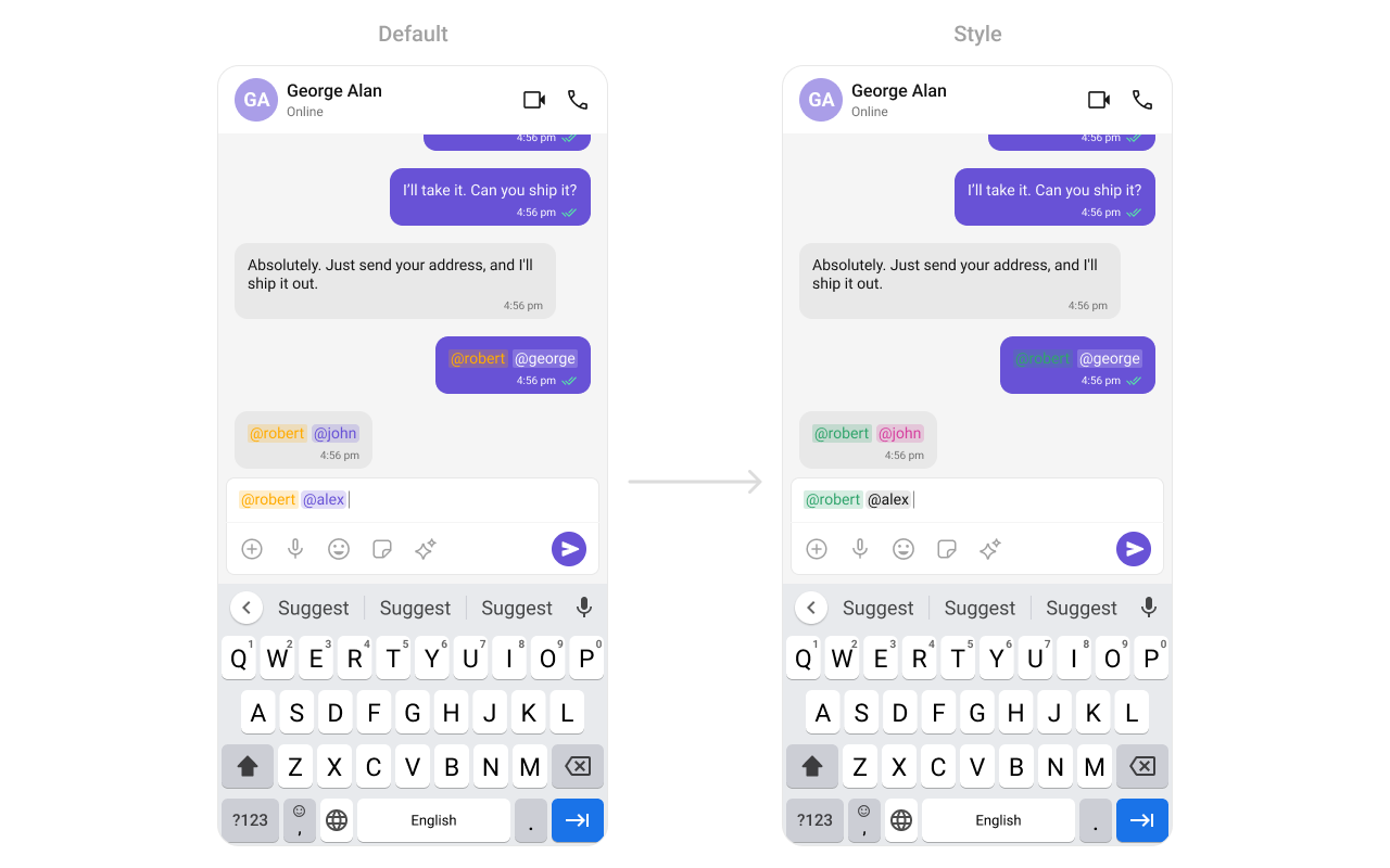
import {
  CometChatMessageComposer,
  CometChatTextFormatter,
  CometChatMentionsFormatter,
} from "@cometchat/chat-uikit-react-native";

const getTextFormatters = () => {
  const textFormatters: CometChatTextFormatter[] = [];
  const mentionsFormatter = new CometChatMentionsFormatter();
  mentionsFormatter.setMentionsStyle({
    textStyle: { color: "#D6409F" },
    selfTextStyle: { color: "#30A46C" },
  });
  textFormatters.push(mentionsFormatter);
  return textFormatters;
};

return (
  <CometChatMessageComposer
    group={group}
    textFormatters={getTextFormatters()}
  />
);

attachmentOptions

Override the default attachment options with custom actions.
import { CometChatMessageComposer } from "@cometchat/chat-uikit-react-native";
import { CometChat } from "@cometchat/chat-sdk-react-native";

const getCustomAttachmentOptions = ({
  user,
  group,
  composerId,
}: {
  user?: CometChat.User;
  group?: CometChat.Group;
  composerId: Map<any, any>;
}): CometChatMessageComposerAction[] => {
  return [
    {
      id: "location",
      icon: LocationIcon,
      title: "Share Location",
      style: { iconStyle: { tintColor: "grey" } },
      onPress: () => {
        // handle location share
      },
    },
  ];
};

return (
  <CometChatMessageComposer
    group={group}
    attachmentOptions={getCustomAttachmentOptions}
  />
);

addAttachmentOptions

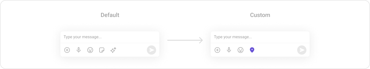
Extends the default attachment options with additional actions.
import { CometChatMessageComposer } from "@cometchat/chat-uikit-react-native";
import { CometChat } from "@cometchat/chat-sdk-react-native";

const getAdditionalAttachmentOptions = ({
  user,
  group,
  composerId,
}: {
  user?: CometChat.User;
  group?: CometChat.Group;
  composerId: Map<any, any>;
}): CometChatMessageComposerAction[] => {
  return [
    {
      id: "location",
      icon: LocationIcon,
      title: "Share Location",
      style: { iconStyle: { tintColor: "grey" } },
      onPress: () => {
        // handle location share
      },
    },
  ];
};

return (
  <CometChatMessageComposer
    group={group}
    addAttachmentOptions={getAdditionalAttachmentOptions}
  />
);

AuxiliaryButtonView

Replace the sticker button area with a custom view.
import { CometChat } from "@cometchat/chat-sdk-react-native";
import { CometChatMessageComposer } from "@cometchat/chat-uikit-react-native";
import { TouchableOpacity, Image, StyleSheet } from "react-native";

const styles = StyleSheet.create({
  button: {
    height: 25,
    width: 25,
    borderRadius: 0,
    backgroundColor: "transparent",
  },
  image: {
    height: 23,
    width: 24,
    tintColor: "#7E57C2",
  },
});

const customAuxiliaryButtonView = ({
  user,
  group,
  composerId,
}: {
  user?: CometChat.User;
  group?: CometChat.Group;
  composerId: string | number;
}): JSX.Element => {
  return (
    <TouchableOpacity style={styles.button} onPress={() => {}}>
      <Image source={LocationIcon} style={styles.image} />
    </TouchableOpacity>
  );
};

return (
  <CometChatMessageComposer
    group={group}
    AuxiliaryButtonView={customAuxiliaryButtonView}
  />
);
The MessageComposer Component utilizes the AuxiliaryButton to provide sticker functionality. Overriding the AuxiliaryButton will replace the sticker functionality.

SendButtonView

Replace the send button with a custom view.
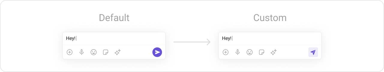
import { CometChat } from "@cometchat/chat-sdk-react-native";
import { CometChatMessageComposer } from "@cometchat/chat-uikit-react-native";
import { TouchableOpacity, Image, StyleSheet } from "react-native";

const styles = StyleSheet.create({
  button: {
    height: 25,
    width: 25,
    borderRadius: 0,
    backgroundColor: "transparent",
  },
  image: {
    height: 23,
    width: 24,
    tintColor: "#7E57C2",
  },
});

const customSendButtonView = ({
  user,
  group,
  composerId,
}: {
  user?: CometChat.User;
  group?: CometChat.Group;
  composerId: string | number;
}): JSX.Element => {
  return (
    <TouchableOpacity style={styles.button} onPress={() => {}}>
      <Image source={SendButtonIcon} style={styles.image} />
    </TouchableOpacity>
  );
};

return (
  <CometChatMessageComposer
    group={group}
    SendButtonView={customSendButtonView}
  />
);

HeaderView

Custom view above the composer input.
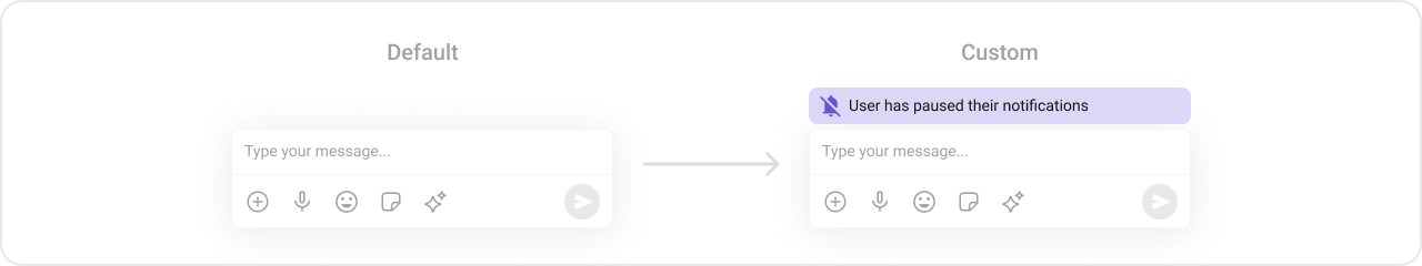
import { CometChat } from "@cometchat/chat-sdk-react-native";
import { CometChatMessageComposer } from "@cometchat/chat-uikit-react-native";
import { View, Text, StyleProp, ViewStyle } from "react-native";

const viewStyle: StyleProp<ViewStyle> = {
  flexDirection: "row",
  alignItems: "flex-start",
  justifyContent: "center",
  padding: 5,
  borderColor: "black",
  borderWidth: 1,
  backgroundColor: "white",
  borderRadius: 10,
  margin: 2,
  marginLeft: 7.4,
  height: 30,
  width: "95.5%",
};

const customHeaderView = ({
  user,
  group,
}: {
  user?: CometChat.User;
  group?: CometChat.Group;
}) => {
  return (
    <View style={viewStyle}>
      <Text style={{ color: "#6851D6", fontWeight: "bold" }}>Chat Bot</Text>
    </View>
  );
};

return (
  <CometChatMessageComposer
    group={group}
    HeaderView={customHeaderView}
  />
);

Styling

Using Style you can customize the look and feel of the component in your app. These parameters typically control elements such as the color, size, shape, and fonts used within the component.

Visibility Props

PropertyDescriptionCode
userUser object for 1-on-1 conversationuser={chatUser}
groupGroup object for group conversationgroup={chatGroup}
disableTypingEventsDisable/enable typing eventsdisableTypingEvents={true}
disableSoundForOutgoingMessagesToggle sound for outgoing messagesdisableSoundForOutgoingMessages={true}
initialComposertextSet predefined textinitialComposertext="Your custom text"
customSoundForOutgoingMessageCustom sound for outgoing messagescustomSoundForOutgoingMessage="your-sound"
hideVoiceRecordingButtonHide voice recording optionhideVoiceRecordingButton={true}
hideCameraOptionHide camera option from attachmentshideCameraOption={true}
hideImageAttachmentOptionHide image attachment optionhideImageAttachmentOption={true}
hideVideoAttachmentOptionHide video attachment optionhideVideoAttachmentOption={true}
hideAudioAttachmentOptionHide audio attachment optionhideAudioAttachmentOption={true}
hideFileAttachmentOptionHide file attachment optionhideFileAttachmentOption={true}
hidePollsAttachmentOptionHide polls attachment optionhidePollsAttachmentOption={true}
hideCollaborativeDocumentOptionHide collaborative document optionhideCollaborativeDocumentOption={true}
hideCollaborativeWhiteboardOptionHide collaborative whiteboard optionhideCollaborativeWhiteboardOption={true}
hideAttachmentButtonHide attachment buttonhideAttachmentButton={true}
hideStickersButtonHide stickers buttonhideStickersButton={true}
hideSendButtonHide send buttonhideSendButton={true}
hideAuxiliaryButtonsHide auxiliary buttonshideAuxiliaryButtons={true}
disableMentionsDisable mentions functionalitydisableMentions={true}
disableMentionAllDisable @all mentiondisableMentionAll={true}
mentionAllLabelCustom label for @all mentionmentionAllLabel="everyone"
imageQualityImage quality for camera (1-100)imageQuality={50}
auxiliaryButtonsAlignmentAlignment of auxiliary buttonsauxiliaryButtonsAlignment="right"

Next Steps