AI Integration Quick Reference
AI Integration Quick Reference
| Field | Value |
|---|---|
| Package | @cometchat/chat-uikit-react-native |
| Key changes | Composite components → modular components, CometChatTheme class → CometChatThemeProvider, nested styles → single style prop |
| View renames | ListItemView → ItemView, TailView → TrailingView, EmptyStateView → EmptyView |
| Property changes | See below |
| Sample app | GitHub |
Introduction
The CometChat v5 React Native UI Kit streamlines the integration of in-app chat functionality into your applications. Packed with prebuilt, modular UI components, it supports essential messaging features for both one-to-one and group conversations. With built-in theming options, including light and dark modes, customizable fonts, colors, and extensive configuration possibilities, developers can create chat experiences tailored to their application’s needs.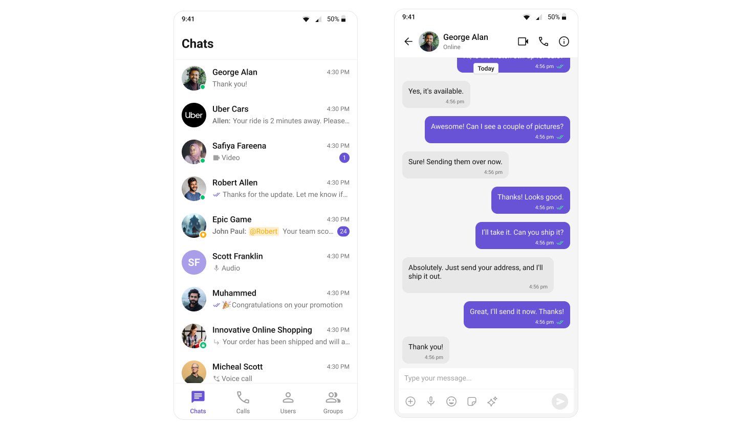
Integration
In v4, integration was straightforward due to the availability of composite components likeCometChatConversationsWithMessages. This single component provided end-to-end functionality, including listing conversations, handling conversation clicks, loading messages (message header, list, composer), displaying user or group details, and supporting threaded messages. Developers could achieve all these features with minimal setup. However, customization posed significant challenges. Customizing the UI or adding custom views required a deep understanding of the internal flow of the composite component. Additionally, configurations were a mix of custom view props, behavioural props, and style props, which often led to confusion. Styling deeply nested components also proved cumbersome, limiting the developer’s ability to make meaningful changes.
Conversations, Message Header, Message List, and Message Composer. This modular approach makes integration more flexible and easier to understand. Each component has a well-defined purpose, allowing developers to use them in ways that suit their specific requirements. The need for complex configurations has been eliminated, as developers can now customize behavior and styling directly via props and theme provider. Styling has been significantly simplified, with every component carefully assigned, enabling developers to customize styles globally or at the component level effortlessly.
To support the transition from v4 to v5, CometChat has built a sample app that replicates the functionality of v4’s composite components. This sample app serves as a reference for developers looking to build additional features such as user/group details, call log details, threaded messages, and advanced messaging capabilities. By following this approach, developers can take full advantage of v5’s modular design while implementing complex functionality in an organized manner.
Learn how to build a complete messaging UI using the v5 UI Kit by following the step-by-step guide here.
Components
The v4 UI Kit provided composite components likeCometChatConversationsWithMessages, which offered end-to-end functionality. These components integrated features such as conversation lists, message views (header, list, composer), user/group details, and threaded messages into a single unit. However, customization of deeply nested components through configuration was challenging and resulted in a suboptimal developer experience.
| Components in v4 UI Kit: | ||
|---|---|---|
| CometChatConversationsWithMessages | CometChatUsersWithMessages | CometChatGroupsWithMessages |
| CometChatMessages | CometChatMessageHeader | CometChatMessageList |
| CometChatMessageComposer | CometChatThreadedMessages | CometChatConversations |
| CometChatUsers | CometChatGroups | CometChatContacts |
| CometChatDetails | CometChatGroupMembers | CometChatAddMembers |
| CometChatBannedMembers | CometChatTransferOwnership | CometChatMessageInformation |
| CometChatIncomingCall | CometChatOngoingCall | CometChatOutgoingCall |
| CometChatCallButtons | CometChatCallLogs | CometChatCallLogDetails |
| CometChatCallLogHistory | CometChatCallLogRecordings | CometChatCallLogParticipants |
| CometChatCallLogsWithDetails | CometChatUserMemberWrapper |
Conversations, Message Header, Message List, and Message Composer. Developers now need to stitch these components together to build the desired functionality. This change allows for greater flexibility and easier customization via props, significantly improving the developer experience while maintaining functionality.
| Components in v5 UI Kit: | ||
|---|---|---|
| CometChatConversations | CometChatUsers | CometChatGroups |
| CometChatGroupMembers | CometChatMessageHeader | CometChatMessageList |
| CometChatMessageComposer | CometChatThreadHeader | CometChatIncomingCall |
| CometChatOutgoingCall | CometChatCallButtons | CometChatCallLogs |
Theming
In v4, theming was managed using the CometChatTheme class, which included two key properties: Typography and Palette. The Palette property provided methods likesetAccent50(), setPrimary(), and setMode() for configuring colors and themes. The theming system relied heavily on React’s Context API, utilizing CometChatThemeProvider and CometChatThemeContext to retrieve and update theme settings. While Context is a core concept in React, it wasn’t the most intuitive or efficient approach for theming.
The v4 approach required developers to instantiate theme objects and call multiple setter methods to achieve the desired styling. For example, switching between light and dark modes required calling myTheme.palette.setMode("dark") on the theme instance. While this approach provided granular control, it involved verbose configuration with multiple method calls for each theme property. Customizing themes required understanding the specific setter methods available for both Palette and Typography classes, making the theming process more complex and requiring more boilerplate code.
App.tsx (v4)
CometChatThemeProvider component that accepts a structured theme object. The complex theme class instantiation and setter methods have been replaced with direct theme object configuration. This approach allows developers to directly define theme properties without needing to understand internal theme class structures.
The new theming system provides better flexibility for component-level styling through theme overrides. Developers can create theme objects that target specific components and their styles, making customization more intuitive and straightforward. The CometChatI18nProvider has also been separated from theming concerns, providing cleaner separation of localization and theme management.
App.tsx (v5)
For detailed guidance on theming and customizing colors in the CometChat React Native UI Kit, refer to the following resources:
- Theming Documentation: Guide to Theming
- Component Styling: Component Styling
Properties
In v5, the approach to component properties has been significantly refined to improve clarity and ease of use. All style-related properties have been streamlined to work seamlessly with the new theming system based on direct property access. This change ensures a more efficient and flexible styling process without the need for verbose or redundant configuration within the component properties. Configuration properties, which were prominent in v4, have also been simplified. With v5’s modular design, components are no longer deeply nested, making complex configurations unnecessary. Developers now have direct control over each component through clearly defined properties, reducing complexity and increasing flexibility in how components are used and styled. Custom view properties have undergone a comprehensive overhaul to ensure consistency across all components. For example, components that are represented as list items now share a uniform set of customizable properties, enabling a standardized approach to customization. These properties include:itemView- Custom view for the entire itemleadingView- Custom view for the leading sectiontrailingView- Custom view for the trailing sectionsubtitleView- Custom view for the subtitletitleView- Custom view for the title
Next Steps
Property Changes
Detailed reference of new, renamed, and removed props for each component
Getting Started
Set up the v5 UI Kit and send your first message
Theming
Customize colors, fonts, and styles with the new theme system
Component Styling
Style individual components using the simplified v5 approach
Property Changes
In CometChat v5 UI Kit, several props and methods in components have been updated. Below is a detailed reference of renamed, added, and removed properties for each component.Conversations
New Properties
| Name | Type | Description |
|---|---|---|
hideSubmitButton | boolean | Hide the submit (selection) button. |
receiptsVisibility | boolean | Toggles message receipts (single/double-tick) inside the subtitle. |
disableSoundForMessages | boolean | Toggle sound playback for received messages. |
customSoundForMessages | string | Custom sound file path for received messages. |
datePattern | (conversation: CometChat.Conversation) => string | Function to generate a custom date string for a conversation. |
ItemView | (item: CometChat.Conversation) => JSX.Element | Completely overrides the default rendering of each conversation item in the list. |
AppBarOptions | () => JSX.Element | Functional component for rendering options in the app bar. |
hideBackButton | boolean | Hide the back button. |
selectionMode | 'none' | 'single' | 'multiple' | Selection mode: 'none', 'single', or 'multiple'. |
onSelection | (conversations: Array<CometChat.Conversation>) => void | Callback when conversation selection is complete. |
onSubmit | (conversations: Array<CometChat.Conversation>) => void | Callback when submit selection button is pressed. |
EmptyView | () => JSX.Element | Custom view for the empty state. |
ErrorView | () => JSX.Element | Custom view for the error state. |
LoadingView | () => JSX.Element | Custom view for the loading state. |
conversationsRequestBuilder | CometChat.ConversationsRequestBuilder | Request builder to fetch conversations. |
LeadingView | (conversation: CometChat.Conversation) => JSX.Element | Custom leading view for a conversation item. |
TitleView | (conversation: CometChat.Conversation) => JSX.Element | Custom title view for a conversation item. |
SubtitleView | (conversation: CometChat.Conversation) => JSX.Element | Custom subtitle view for a conversation item. |
TrailingView | (conversation: CometChat.Conversation) => JSX.Element | Custom tail view for a conversation item. |
hideError | boolean | Hide error view. |
onItemPress | (item: CometChat.Conversation) => void | Callback for when a conversation item is pressed. |
onItemLongPress | (item: CometChat.Conversation) => void | Callback for when a conversation item is long pressed. |
onError | (e: CometChat.CometChatException) => void | Callback when an error occurs while fetching conversations. |
onBack | () => void | Callback for when the back action is triggered. |
textFormatters | Array<CometChatMentionsFormatter | CometChatUrlsFormatter | CometChatTextFormatter> | Array of text formatter classes. |
style | DeepPartial<ConversationStyle> | Custom styles for the conversation view. |
hideHeader | boolean | Hide the header of the conversation list. |
onEmpty | () => void | Callback triggered when the fetched list is empty. |
onLoad | (list: CometChat.Conversation[]) => void | Callback triggered once the users have loaded and are not empty. |
options | (conversation: CometChat.Conversation) => MenuItemInterface[] | A function to replace the default menu items entirely for a conversation. |
addOptions | (conversation: CometChat.Conversation) => MenuItemInterface[] | A function to append more menu items on top of the default menu items for a conversation. |
usersStatusVisibility | boolean | Toggle user status visibility. |
groupTypeVisibility | boolean | Toggle group type visibility. |
deleteConversationOptionVisibility | boolean | Toggle delete conversation option visibility. |
Renamed Properties
| V4 Name | V5 Name | Type | Description |
|---|---|---|---|
hideSubmitIcon | hideSubmitButton | boolean | Hide the submit (selection) button. |
disableUsersPresence | usersStatusVisibility | boolean | Toggle user status visibility. |
hideReceipt / disableReceipt | receiptsVisibility | boolean | Controls receipt visibility. |
tailView | TrailingView | function | Custom tail/trailing view for a conversation item. |
ListItemView | ItemView | function | Completely overrides the default rendering of each conversation item in the list. |
AppBarOption | AppBarOptions | function | Functional component for rendering options in the app bar. |
showBackButton | hideBackButton | boolean | In v5, the prop is inverted (showBackButton=false → hideBackButton=true). |
conversationsStyle | style | object | Style object for conversations (renamed and type changed). |
EmptyStateView | EmptyView | function | Custom view for the empty state. |
ErrorStateView | ErrorView | function | Custom view for the error state. |
LoadingStateView | LoadingView | function | Custom view for the loading state. |
Removed Properties
| V4 Name | Type | Description |
|---|---|---|
protectedGroupIcon | ImageType | Custom icon for protected group. |
privateGroupIcon | ImageType | Custom icon for private group. |
readIcon | ImageType | Custom icon for read message. |
deliveredIcon | ImageType | Custom icon for delivered message. |
sentIcon | ImageType | Custom icon for sent message. |
errorIcon | ImageType | Custom icon for error message. |
waitingIcon | ImageType | Custom icon for waiting message. |
options (swipe actions) | function | Pass array of CometChatOptions type for swipe actions. |
hideSeparator | boolean | Toggle separator. |
backButtonIcon | ImageType | Icon for back button. |
title | string | Title to be shown, default "Chats". |
emptyStateText | string | Text to be displayed if no conversation found. |
errorStateText | string | Text to be displayed if there is an error. |
conversationsStyle (old type) | object | (Renamed to style, but if old type, it’s removed). |
listItemStyle | object | Style object for list item. |
avatarStyle | object | Style object for avatar. |
statusIndicatorStyle | object | Style object for status indicator. |
dateStyle | object | Style object for date. |
receiptStyle | object | Style object for receipt. |
badgeStyle | object | Style object for badge. |
confirmDialogStyle | object | Style object for confirm dialog. |
disableTyping | boolean | Toggle typing indicator. |
disableMentions | boolean | If true, mentions will be disabled. |
Users
New Properties
| Name | Type | Description |
|---|---|---|
onSubmit | (list: Array<CometChat.User>) => void | Callback when submit selection button is pressed. |
style | DeepPartial<UserStyle> | Custom styling for the users list. |
TitleView | (user: CometChat.User) => JSX.Element | Custom title view component. |
ItemView | (user: CometChat.User) => JSX.Element | Function that returns a custom list item view. |
EmptyView | () => JSX.Element | Custom component to display for the empty state. |
ErrorView | () => JSX.Element | Custom component to display for the error state. |
LoadingView | () => JSX.Element | Custom component to display for the loading state. |
LeadingView | (user: CometChat.User) => JSX.Element | Custom leading view component. |
hideHeader | boolean | Hide the header view. |
searchPlaceholderText | string | Placeholder text for the search input. |
usersStatusVisibility | boolean | Hide the users status. |
searchKeyword | string | Search keyword. |
onError | (e: CometChat.CometChatException) => void | Callback when an error occurs. |
hideLoadingState | boolean | Hide the loading skeleton. |
title | string | Title for the header. |
addOptions | (user: CometChat.User) => MenuItemInterface[] | A function to append more menu items on top of the default menu items for a user. |
hideError | boolean | Toggle error view visibility. |
showBackButton | boolean | Toggle back button visibility. |
stickyHeaderVisibility | boolean | Toggle sticky header visibility. |
Renamed Properties
| V4 Name | V5 Name | Type | Description |
|---|---|---|---|
usersStyle | style | object | Custom styling for the users list. |
TailView | TrailingView | function | Function that returns a custom trailing view for a user. |
disableUsersPresence | usersStatusVisibility | boolean | Toggle user status visibility |
ListItemView | ItemView | function | Function that returns a custom list item view. |
Removed Properties
| V4 Name | Type | Description |
|---|---|---|
listItemKey | any | Key for list item (removed in v5). |
Groups
New Properties
| Name | Type | Description |
|---|---|---|
TitleView | (group: CometChat.Group) => JSX.Element | Custom title view for a group item. |
SubtitleView | (group: CometChat.Group) => JSX.Element | Custom subtitle view for a group item. |
TrailingView | (group: CometChat.Group) => JSX.Element | Custom trailing view for a group item. |
ItemView | (group: CometChat.Group) => JSX.Element | Completely overrides the default rendering of each group item in the list. |
AppBarOptions | () => JSX.Element | Functional component for rendering options in the app bar. |
hideSubmitButton | boolean | Hide the submit (selection) button. |
style | DeepPartial<GroupStyle> | Custom styles for the groups view. |
searchPlaceholderText | string | Placeholder text for the search input. |
selectionMode | 'none' | 'single' | 'multiple' | Selection mode: 'none', 'single', or 'multiple'. |
onSelection | (list: Array<CometChat.Group>) => void | Callback when group selection is complete. |
onSubmit | (list: Array<CometChat.Group>) => void | Callback when submit selection button is pressed. |
hideSearch | boolean | Hide the search box. |
EmptyView | () => JSX.Element | Custom view for the empty state. |
ErrorView | () => JSX.Element | Custom view for the error state. |
LoadingView | () => JSX.Element | Custom view for the loading state. |
groupsRequestBuilder | CometChat.GroupsRequestBuilder | Request builder to fetch groups. |
searchRequestBuilder | CometChat.GroupsRequestBuilder | Request builder for search functionality. |
privateGroupIcon | ImageSourcePropType | Icon to be used for private groups. |
passwordGroupIcon | ImageSourcePropType | Icon to be used for password-protected groups. |
hideError | boolean | Hide error view. |
onItemPress | (item: CometChat.Group) => void | Callback for when a group item is pressed. |
onItemLongPress | (item: CometChat.Group) => void | Callback for when a group item is long pressed. |
onError | (e: CometChat.CometChatException) => void | Callback when an error occurs while fetching groups. |
onBack | () => void | Callback for when the back action is triggered. |
hideHeader | boolean | Hide the header of the group list. |
LeadingView | (group: CometChat.Group) => JSX.Element | Custom leading view for a group item. |
searchKeyword | string | Search keyword. |
onEmpty | () => void | Callback triggered when the fetched list is empty. |
onLoad | (list: CometChat.GroupMember[]) => void | Callback triggered once the groups have loaded and are not empty. |
hideLoadingState | boolean | Hide the loading skeleton. |
groupTypeVisibility | boolean | Hide the group type (public/private/password). |
addOptions | (group: CometChat.Group) => MenuItemInterface[] | A function to append more menu items on top of the default menu items for a group. |
options | (group: CometChat.Group) => MenuItemInterface[] | A function to replace the default menu items entirely for a group. |
Renamed Properties
| V4 Name | V5 Name | Type | Description |
|---|---|---|---|
ListItemView | ItemView | function | Completely overrides the default rendering of each group item in the list. |
AppBarOption | AppBarOptions | function | Functional component for rendering options in the app bar. |
hideSubmitIcon | hideSubmitButton | boolean | Hide the submit (selection) button. |
groupsStyle | style | object | Style object for groups (renamed and type changed). |
searchPlaceHolderText | searchPlaceholderText | string | Placeholder text for the search input. |
EmptyStateView | EmptyView | function | Custom view for the empty state. |
ErrorStateView | ErrorView | function | Custom view for the error state. |
LoadingStateView | LoadingView | function | Custom view for the loading state. |
privateGroupIcon | privateGroupIcon | ImageType → ImageSourcePropType | Icon to be used for private groups (type changed). |
passwordGroupIcon | passwordGroupIcon | ImageType → ImageSourcePropType | Icon to be used for password-protected groups (type changed). |
Removed Properties
| V4 Name | Type | Description |
|---|---|---|
hideSeperator | boolean | Toggle separator (removed, not present in v5). |
listItemStyle | object | Style object for list item (removed, not present in v5). |
avatarStyle | object | Style object for avatar (removed, not present in v5). |
statusIndicatorStyle | object | Style object for status indicator (removed, not present in v5). |
backButtonIcon | ImageType | Icon for back button (removed, not present in v5). |
searchBoxIcon | ImageType | Icon for search box (removed, not present in v5). |
title | string | Title to be shown, default "Groups" (removed, not present in v5). |
emptyStateText | string | Text to be displayed if no group found (removed, not present in v5). |
errorStateText | string | Text to be displayed if there is an error (removed, not present in v5). |
Group Members
New Properties
| Name | Type | Description |
|---|---|---|
SubtitleView | (item: CometChat.GroupMember) => JSX.Element | Custom subtitle view for a group member item. |
TitleView | (item: CometChat.GroupMember) => JSX.Element | Custom title view for a group member item. |
TrailingView | (item: CometChat.GroupMember) => JSX.Element | Custom trailing view for a group member item. |
EmptyView | () => JSX.Element | Custom view for the empty state. |
ErrorView | () => JSX.Element | Custom view for the error state. |
LoadingView | () => JSX.Element | Custom view for the loading state. |
onItemPress | (groupMember: CometChat.GroupMember) => void | Callback when a group member item is pressed. |
onItemLongPress | (groupMember: CometChat.GroupMember) => void | Callback when a group member item is long pressed. |
onSelection | (list: CometChat.GroupMember[]) => void | Callback when group member selection is complete. |
onSubmit | (list: Array<CometChat.GroupMember>) => void | Callback when submit selection button is pressed. |
searchRequestBuilder | CometChat.GroupMembersRequestBuilder | Request builder for search functionality. |
groupMemberRequestBuilder | CometChat.GroupMembersRequestBuilder | Request builder to fetch group members. |
group | CometChat.Group | The group object for which members are listed. |
style | DeepPartial<GroupMemberStyle> | Custom styles for the group member view. |
ItemView | (item: CometChat.GroupMember) => JSX.Element | Completely overrides the default rendering of each group member item. |
LeadingView | (item: CometChat.GroupMember) => JSX.Element | Custom leading view for a group member item. |
onEmpty | () => void | Callback triggered when the fetched list is empty. |
onLoad | (list: CometChat.GroupMember[]) => void | Callback triggered once the group members have loaded and are not empty. |
options | (member: CometChat.GroupMember, group: CometChat.Group) => MenuItemInterface[] | Function to replace default menu items entirely for a group member. |
addOptions | (member: CometChat.GroupMember, group: CometChat.Group) => MenuItemInterface[] | Function to append more menu items on top of default menu items for a group member. |
hideKickMemberOption | boolean | Hide the “Remove” (Kick) option from the default menu. |
hideBanMemberOption | boolean | Hide the “Ban” option from the default menu. |
hideScopeChangeOption | boolean | Hide the “Change Scope” option from the default menu. |
hideLoadingState | boolean | Hide the loading skeleton. |
usersStatusVisibility | boolean | Toggle user status visibility. |
hideHeader | boolean | Hide the header view. |
onError | () => void | Callback when an error occurs. |
searchKeyword | string | Search keyword. |
showBackButton | boolean | Toggle back button visibility. |
excludeOwner | boolean | Exclude owner from the list. |
Renamed Properties
| V4 Name | V5 Name | Type | Description |
|---|---|---|---|
TailView | TrailingView | function | Custom trailing view for a group member item. |
groupMemberStyle | style | object | Style object for group member (renamed and type changed). |
disableUsersPresence | usersStatusVisibility | boolean | Toggle user status visibility |
ListItemView | ItemView | function | Completely overrides the default rendering of each group member item. |
EmptyStateView | EmptyView | function | Custom view for the empty state. |
ErrorStateView | ErrorView | function | Custom view for the error state. |
LoadingStateView | LoadingView | function | Custom view for the loading state. |
Removed Properties
| V4 Name | Type | Description |
|---|---|---|
listItemStyle | object | Style object for list item (removed in v5). |
avatarStyle | object | Style object for avatar (removed in v5). |
statusIndicatorStyle | object | Style object for status indicator (removed in v5). |
groupScopeStyle | object | Styling properties for group scope (removed in v5). |
title | string | Title for the list (removed in v5). |
errorStateText | string | Text to be displayed when error occurs (removed in v5). |
emptyStateText | string | Text to be displayed when the list is empty (removed in v5). |
theme | CometChatTheme | Theme configuration for the group members component (removed in v5). |
Message Header
New Properties
| Name | Type | Description |
|---|---|---|
ItemView | ({ user, group }: { user?: CometChat.User; group?: CometChat.Group }) => JSX.Element | Custom item view. Receives { user, group }. |
LeadingView | ({ user, group }: { user?: CometChat.User; group?: CometChat.Group }) => JSX.Element | Custom leading view. Receives { user, group }. |
TitleView | ({ user, group }: { user?: CometChat.User; group?: CometChat.Group }) => JSX.Element | Custom title view. Receives { user, group }. |
SubtitleView | ({ user, group }: { user?: CometChat.User; group?: CometChat.Group }) => JSX.Element | Custom subtitle view. Receives { user, group }. |
TrailingView | ({ user, group }: { user?: CometChat.User; group?: CometChat.Group }) => JSX.Element | Custom trailing view. Receives { user, group }. |
AuxiliaryButtonView | ({ user, group }: { user?: CometChat.User; group?: CometChat.Group }) => JSX.Element | Custom auxiliary button view. Receives { user, group }. |
user | CometChat.User | User object. |
group | CometChat.Group | Group object. |
showBackButton | boolean | Toggle back button visibility. |
onBack | () => void | Callback when back button is pressed. |
style | DeepPartial<MessageHeaderStyle> | Custom styles. |
onError | (error: CometChat.CometChatException) => void | Error callback. |
hideVoiceCallButton | boolean | Toggle visibility of voice call button. |
hideVideoCallButton | boolean | Toggle visibility of video call button. |
usersStatusVisibility | boolean | Toggle visibility of user status. |
hideNewChatButton | boolean | Flag to hide the new chat button for AI agents (only applies to @agentic users). |
hideChatHistoryButton | boolean | Flag to hide the chat history button for AI agents (only applies to @agentic users). |
onNewChatButtonClick | () => void | Callback when agent new chat button is clicked (only applies to @agentic users). |
onChatHistoryButtonClick | () => void | Callback when agent chat history button is clicked (only applies to @agentic users). |
Renamed Properties
| V4 Name | V5 Name | Type | Description |
|---|---|---|---|
ListItemView | ItemView | function | Custom item view. |
AppBarOptions | TrailingView | function | Custom trailing view. |
hideBackIcon | showBackButton | boolean | In v5, the prop is inverted (hideBackIcon=true → showBackButton=false). |
disableUsersPresence | usersStatusVisibility | boolean | Toggle user status visibility |
style | style | object | Style object for message header (renamed and type changed). |
Removed Properties
| V4 Name | Type | Description |
|---|---|---|
protectedGroupIcon | ImageType | Custom icon for protected group (removed in v5). |
privateGroupIcon | ImageType | Custom icon for private group (removed in v5). |
backButtonIcon | ImageType | Icon for back button (removed in v5). |
disableTyping | boolean | Controls typing indicator functionality (removed in v5). |
avatarStyle | object | Style configuration for avatar (removed in v5). |
statusIndicatorStyle | object | Style configuration for status indicator (removed in v5). |
headViewContainerStyle | object | Custom styling for headViewContainer in list item (removed in v5). |
bodyViewContainerStyle | object | Custom styling for bodyViewContainerStyle in list item (removed in v5). |
tailViewContainerStyle | object | Custom styling for tailViewContainerStyle in list item (removed in v5). |
listItemStyle | object | Custom styling for list item (removed in v5). |
Message List
New Properties
| Name | Type | Description |
|---|---|---|
parentMessageId | string | ID of the parent message when rendering threaded messages. |
user | CometChat.User | The user object associated with the message list. |
group | CometChat.Group | The group object associated with the message list. |
EmptyView | () => JSX.Element | A component to display when there are no messages. |
ErrorView | () => JSX.Element | A component to display when an error occurs. |
hideError | boolean | Flag to hide the error view. |
LoadingView | () => JSX.Element | A component to display while messages are loading. |
receiptsVisibility | boolean | Flag to hide read receipts. |
disableSoundForMessages | boolean | Flag to disable sound for incoming messages. |
customSoundForMessages | string | Custom sound URL for messages. |
alignment | MessageListAlignmentType | Alignment type for the message list. |
avatarVisibility | boolean | Flag to show or hide the user’s avatar. |
datePattern | (message: CometChat.BaseMessage) => string | Function that returns a custom string representation for a message’s date. |
dateSeparatorPattern | (date: number) => string | Function that returns a custom date separator string based on a timestamp. |
templates | Array<CometChatMessageTemplate> | An array of message templates for rendering custom message types. |
addTemplates | Array<CometChatMessageTemplate> | An array of message templates for rendering custom message types. |
messageRequestBuilder | CometChat.MessagesRequestBuilder | Builder for constructing a request to fetch messages. |
scrollToBottomOnNewMessages | boolean | If true, the message list will scroll to the bottom when new messages arrive. |
onThreadRepliesPress | (messageObject: CometChat.BaseMessage, messageBubbleView: () => JSX.Element | null) => void | Callback invoked when the thread replies view is pressed. |
HeaderView | ({ user, group, id }: { user?: CometChat.User; group?: CometChat.Group; id?: { uid?: string; guid?: string; parentMessageId?: string } }) => JSX.Element | Custom header view component. |
FooterView | ({ user, group, id }: { user?: CometChat.User; group?: CometChat.Group; id?: { uid?: string; guid?: string; parentMessageId?: string } }) => JSX.Element | Custom footer view component. |
onError | (e: CometChat.CometChatException) => void | Callback to handle errors. |
onBack | () => void | Callback invoked on back navigation. |
textFormatters | Array<CometChatMentionsFormatter | CometChatUrlsFormatter | CometChatTextFormatter> | Collection of text formatter classes to apply custom formatting. |
onReactionPress | (reaction: CometChat.ReactionCount, messageObject: CometChat.BaseMessage) => void | Callback invoked when a reaction is pressed. |
onReactionLongPress | (reaction: CometChat.ReactionCount, messageObject: CometChat.BaseMessage) => void | Callback invoked when a reaction is long pressed. |
onReactionListItemPress | (messageReaction: CometChat.Reaction, messageObject: CometChat.BaseMessage) => void | Callback invoked when an item in the reaction list is pressed. |
style | DeepPartial<CometChatTheme["messageListStyles"]> | Custom styles for the message list component. |
reactionsRequestBuilder | CometChat.ReactionsRequestBuilder | Builder for constructing a request to fetch reactions. |
onAddReactionPress | () => void | Callback invoked when the add reaction button is pressed. |
quickReactionList | [string, string?, string?, string?, string?] | List of quick reactions. |
onLoad | (messageList: CometChat.BaseMessage[]) => void | Callback to handle when the message list is loaded. |
onEmpty | () => void | Callback to handle when the message list is empty. |
hideReplyInThreadOption | boolean | Flag to hide the reply in thread option. |
hideShareMessageOption | boolean | Flag to hide the share message option. |
hideEditMessageOption | boolean | Flag to hide the edit message option. |
hideTranslateMessageOption | boolean | Flag to hide the translate message option. |
hideDeleteMessageOption | boolean | Flag to hide the delete message option. |
hideReactionOption | boolean | Flag to hide the react to message option. |
hideMessagePrivatelyOption | boolean | Flag to hide the message privately option. |
hideCopyMessageOption | boolean | Flag to hide the copy message option. |
hideMessageInfoOption | boolean | Flag to hide the message info option. |
hideGroupActionMessages | boolean | Flag to hide group action messages. |
hideTimestamp | boolean | Flag to hide the timestamp on message bubbles. |
suggestedMessages | Array<string> | Array of suggested messages for AI agent empty view (only applies to @agentic users). |
hideSuggestedMessages | boolean | Flag to hide suggested messages in AI agent empty view (only applies to @agentic users). |
emptyChatGreetingView | React.ReactNode | Custom AI agent greeting view (only applies to @agentic users). |
emptyChatIntroMessageView | React.ReactNode | Custom AI agent intro message view (only applies to @agentic users). |
emptyChatImageView | React.ReactNode | Custom AI agent image/avatar view (only applies to @agentic users). |
onSuggestedMessageClick | (suggestion: string) => void | Callback when suggested message is clicked (only applies to @agentic users). |
aiAssistantTools | CometChatAIAssistantTools | Custom AI assistant tools with action functions (only applies to @agentic users). |
streamingSpeed | number | Controls the speed of AI message streaming (only applies to @agentic users). |
Renamed Properties
| V4 Name | V5 Name | Type | Description |
|---|---|---|---|
EmptyStateView | EmptyView | () => JSX.Element | Custom component to display for the empty state. |
ErrorStateView | ErrorView | () => JSX.Element | Custom component to display for the error state. |
LoadingStateView | LoadingView | () => JSX.Element | Custom component to display for the loading state. |
hideReceipt / disableReceipt | receiptsVisibility | boolean | Controls receipt visibility. |
showAvatar | avatarVisibility | boolean | Toggle visibility for avatar. |
dateSeparatorPattern | dateSeparatorPattern | (date: number) => string | Signature clarified with parameter name. |
Removed Properties
| V4 Name | Type | Description |
|---|---|---|
emptyStateText | string | Text to be displayed if no message found. |
errorStateText | string | Text to be displayed if there is an error. |
readIcon | ImageType | Custom icon for read message. |
deliveredIcon | ImageType | Custom icon for delivered message. |
sentIcon | ImageType | Custom icon for sent message. |
waitIcon | ImageType | Custom icon for waiting message. |
errorIcon | ImageType | Custom icon for error message. |
wrapperMessageBubbleStyle | MessageBubbleStyleInterface | Style for message bubble wrapper. |
avatarStyle | AvatarStyleInterface | Style configuration for avatar. |
dateSeperatorStyle | DateStyleInterface | Style for date separator. |
actionSheetStyle | ActionSheetStylesInterface | Style for action sheet. |
messageListStyle | MessageListStyleInterface | Style configuration for message list. |
messageInformationConfiguration | CometChatMessageInformationConfigurationInterface | Configuration for message information. |
reactionsConfiguration | ReactionsConfigurationInterface | Message Reaction Configuration. |
reactionListConfiguration | ReactionListConfigurationInterface | Message Reaction List Configuration. |
quickReactionConfiguration | QuickReactionsConfigurationInterface | Quick Reaction Configuration. |
emojiKeyboardStyle | EmojiKeyboardStyle | Emoji Keyboard style. |
disableReactions | boolean | Disables the reactions functionality. |
disableMentions | boolean | Disables mentions functionality. |
timeStampAlignment | MessageTimeAlignmentType | Alignment for message timestamps. |
newMessageIndicatorText | string | Custom text for new message indicator. |
hideActionSheetHeader | boolean | Hide the header of the action sheet. |
Message Composer
New Properties
| Name | Type | Description |
|---|---|---|
id | string | number | Message composer identifier. |
user | CometChat.User | CometChat SDK’s user object. |
group | CometChat.Group | CometChat SDK’s group object. |
disableSoundForOutgoingMessages | boolean | Flag to turn off sound for outgoing messages. |
customSoundForOutgoingMessage | any | Custom audio sound to be played while sending messages. |
disableTypingEvents | boolean | Flag to disable typing events. |
initialComposertext | string | Initial text to be displayed in the composer. |
HeaderView | ({ user, group }: { user?: CometChat.User; group?: CometChat.Group }) => JSX.Element | Renders a preview section at the top of the composer. |
onTextChange | (text: string) => void | Callback triggered when the input text changes. |
attachmentOptions | ({ user, group, composerId }: { user?: CometChat.User; group?: CometChat.Group; composerId: Map<any, any>; }) => CometChatMessageComposerAction[] | Returns the attachment options for the composer. |
AuxiliaryButtonView | ({ user, group, composerId }: { user?: CometChat.User; group?: CometChat.Group; composerId: string | number; }) => JSX.Element | Replaces the default Auxiliary Button. |
SendButtonView | ({ user, group, composerId }: { user?: CometChat.User; group?: CometChat.Group; composerId: string | number; }) => JSX.Element | Replaces the default Send Button. |
parentMessageId | string | number | Message id required for threaded messages. |
style | DeepPartial<CometChatTheme["messageComposerStyles"]> | Custom styles for the message composer component. |
hideVoiceRecordingButton | boolean | Flag to hide the voice recording button. |
onSendButtonPress | (message: CometChat.BaseMessage) => void | Callback triggered when the send button is pressed. |
onError | (error: CometChat.CometChatException) => void | Callback triggered when an error occurs. |
keyboardAvoidingViewProps | KeyboardAvoidingViewProps | Override properties for the KeyboardAvoidingView. |
textFormatters | Array<CometChatMentionsFormatter | CometChatUrlsFormatter | CometChatTextFormatter> | Collection of text formatter classes to apply custom formatting. |
disableMentions | boolean | Flag to disable mention functionality. |
imageQuality | IntRange<1, 100> | Controls image quality when taking pictures from the camera. |
hideCameraOption | boolean | If true, hides the camera option from the attachment options. |
hideImageAttachmentOption | boolean | If true, hides the image attachment option from the attachment options. |
hideVideoAttachmentOption | boolean | If true, hides the video attachment option from the attachment options. |
hideAudioAttachmentOption | boolean | If true, hides the audio attachment option from the attachment options. |
hideFileAttachmentOption | boolean | If true, hides the file/document attachment option from the attachment options. |
hidePollsAttachmentOption | boolean | If true, hides the polls option from the attachment options. |
hideCollaborativeDocumentOption | boolean | If true, hides the collaborative document option. |
hideCollaborativeWhiteboardOption | boolean | If true, hides the collaborative whiteboard option. |
hideAttachmentButton | boolean | If true, hides the entire attachment button from the composer. |
hideStickersButton | boolean | If true, hides the stickers button from the composer. |
hideSendButton | boolean | If true, hides the send button from the composer. |
hideAuxiliaryButtons | boolean | If true, hides all auxiliary buttons (such as voice input, GIFs, or other plugin buttons). |
addAttachmentOptions | ({ user, group, composerId }: { user?: CometChat.User; group?: CometChat.Group; composerId: Map<any, any>; }) => CometChatMessageComposerAction[] | Returns additional attachment options for the composer. |
auxiliaryButtonsAlignment | "left" | "right" | Determines the alignment of auxiliary buttons. |
Renamed Properties
| V4 Name | V5 Name | Type | Description |
|---|---|---|---|
disableSoundForMessages | disableSoundForOutgoingMessages | boolean | Renamed for clarity. |
customSoundForMessage | customSoundForOutgoingMessage | any | Renamed for clarity. |
text | initialComposertext | string | Renamed for clarity. |
onChangeText | onTextChange | (text: string) => void | Renamed for clarity. |
hideVoiceRecording | hideVoiceRecordingButton | boolean | Renamed for clarity. |
attachmentOptions | attachmentOptions | function signature changed | Function signature updated. |
SecondaryButtonView | AuxiliaryButtonView | function signature changed | Function signature updated and renamed. |
Removed Properties
| V4 Name | Type | Description |
|---|---|---|
FooterView | React.FC | Preview section at the bottom of the composer. |
placeHolderText | string | Text shown in the composer when the input message is empty. |
maxHeight | number | Threshold value for input expansion. |
attachmentIcon | ImageType | Attachment icon. |
messageComposerStyle | MessageComposerStyleInterface | Message Composer Styles. |
hideLiveReaction | boolean | Hide the live reaction button. |
liveReactionIcon | ImageType | Live reaction icon. |
voiceRecordingIconURL | string | ImageType | Image URL for the voice recording icon. |
mediaRecorderStyle | MediaRecorderStyle | Voice Recording Styles. |
pauseIconUrl | ImageType | Pause icon. |
playIconUrl | ImageType | Play icon. |
recordIconUrl | ImageType | Record icon. |
deleteIconUrl | ImageType | Delete icon. |
stopIconUrl | ImageType | Stop icon. |
submitIconUrl | ImageType | Submit icon. |
AIIconURL | string | AI Icon URL. |
aiOptionsStyle | AIOptionsStyle | AI Options Style. |
Incoming Call
New Properties
| Name | Type | Description |
|---|---|---|
call | CometChat.Call | CometChat.CustomMessage | any | The incoming call object, which can be a Call or a CustomMessage. |
ItemView | (call: CometChat.Call | CometChat.CustomMessage) => JSX.Element | Custom view for the entire call item. |
TitleView | (call: CometChat.Call | CometChat.CustomMessage) => JSX.Element | Custom view for the title section of the call item. |
SubtitleView | (call: CometChat.Call | CometChat.CustomMessage) => JSX.Element | Custom view for the subtitle section of the call item. |
LeadingView | (call: CometChat.Call | CometChat.CustomMessage) => JSX.Element | Custom view for the leading section of the call item. |
TrailingView | (call: CometChat.Call | CometChat.CustomMessage) => JSX.Element | Custom view for the trailing section of the call item. |
disableSoundForCalls | boolean | Flag to disable sound for incoming calls. |
customSoundForCalls | string | Path or identifier for a custom sound to play for incoming calls. |
onAccept | (message: CometChat.BaseMessage) => void | Callback fired when the call is accepted. |
onDecline | (message: CometChat.BaseMessage) => void | Callback fired when the call is declined. |
onError | (e: CometChat.CometChatException) => void | Callback fired when an error occurs. |
callSettingsBuilder | typeof CometChatCalls.CallSettingsBuilder | Optional custom call settings builder. |
style | DeepPartial<IncomingCallStyle> | Custom style overrides for the incoming call component. |
Renamed Properties
| V4 Name | V5 Name | Type | Description |
|---|---|---|---|
SubtitleView | SubtitleView | function signature changed | Function signature updated. |
incomingCallStyle | style | IncomingCallStyleInterface → DeepPartial<IncomingCallStyle> | Style object for incoming call (renamed and type changed). |
onAccept | onAccept | function signature changed | Function signature updated. |
onDecline | onDecline | function signature changed | Function signature updated. |
Removed Properties
| V4 Name | Type | Description |
|---|---|---|
title | string | Custom title text. |
acceptButtonText | string | Accept button text. |
declineButtonText | string | Decline button text. |
avatarStyle | AvatarStyleInterface | Style configuration for avatar. |
ongoingCallScreenStyle | OngoingCallStyleInterface | Style for ongoing call screen. |
Outgoing Call
New Properties
| Name | Type | Description |
|---|---|---|
onEndCallButtonPressed | (call: CometChat.Call) => void | Callback for when the end/cancel button is pressed. |
EndCallView | (call: CometChat.Call | CometChat.CustomMessage) => JSX.Element | Custom view for the end call button. |
TitleView | (call: CometChat.Call | CometChat.CustomMessage) => JSX.Element | Custom view for the title section. |
SubtitleView | (call: CometChat.Call | CometChat.CustomMessage) => JSX.Element | Custom view for the subtitle section. |
AvatarView | (call: CometChat.Call | CometChat.CustomMessage) => JSX.Element | Custom view for the avatar section. |
Renamed Properties
| V4 Name | V5 Name | Type | Description |
|---|---|---|---|
onDeclineButtonPressed | onEndCallButtonPressed | (call: CometChat.Call) => void | Renamed for clarity and consistency. |
declineButtonIcon | EndCallView | ImageType → (call: CometChat.Call | CometChat.CustomMessage) => JSX.Element | Changed from icon/image to custom view. |
declineButtonText | EndCallView | string → (call: CometChat.Call | CometChat.CustomMessage) => JSX.Element | Changed from text to custom view. |
outgoingCallStyle | style | OutgoingCallStyleInterface → DeepPartial<OutgoingCallStyle> | Style object renamed and type changed. |
Removed Properties
| V4 Name | Type | Description |
|---|---|---|
buttonStyle | ButtonStyleInterface | Style object for button (removed, not present in v5). |
avatarStyle | AvatarStyleInterface | Style object for avatar (removed, not present in v5). |
declineButtonText | string | Decline button text (replaced by EndCallView). |
declineButtonIcon | ImageType | Decline button icon (replaced by EndCallView). |
onDeclineButtonPressed | (call: CometChat.Call) => void | Callback (renamed to onEndCallButtonPressed). |
outgoingCallStyle | OutgoingCallStyleInterface | Style object (renamed to style). |
callSettingsBuilder | typeof CometChatCalls.CallSettingsBuilder | (Moved to new properties, type clarified). |
theme | CometChatTheme | Theme configuration (removed, not present in v5). |
cardStyle | CardStyleInterface | Card style (removed, not present in v5). |
ongoingCallConfiguration | OngoingCallConfigurationInterface | Ongoing call config (removed, not present in v5). |
Call Buttons
New Properties
| Name | Type | Description |
|---|---|---|
callSettingsBuilder | (user?: CometChat.User, group?: CometChat.Group, isAudioOnly?: boolean) => typeof CometChatCalls.CallSettingsBuilder | Function to build call settings for call initialization. |
outgoingCallConfiguration | OutgoingCallConfiguration | Configuration for outgoing calls. |
style | DeepPartial<CallButtonStyle> | Custom style overrides for the call button. |
Renamed Properties
| V4 Name | V5 Name | Type | Description |
|---|---|---|---|
hideVoiceCall | hideVoiceCallButton | boolean | Renamed for clarity. |
hideVideoCall | hideVideoCallButton | boolean | Renamed for clarity. |
callButtonStyle | style | CallButtonStyleInterface → DeepPartial<CallButtonStyle> | Style object renamed and type changed. |
Removed Properties
| V4 Name | Type | Description |
|---|---|---|
voiceCallIconImage | ImageType | Image icon for voice calls. |
voiceCallIconText | string | Text label for the voice call icon. |
videoCallIconImage | ImageType | Image icon for video calls. |
videoCallIconText | string | Text label for the video call icon. |
onVoiceCallPress | (params: { user?: CometChat.User, group?: CometChat.Group }) => void | Callback for voice call icon click. |
onVideoCallPress | (params: { user?: CometChat.User, group?: CometChat.Group }) => void | Callback for video call icon click. |
callButtonStyle | CallButtonStyleInterface | Style object (renamed to style). |
Call Logs
New Properties
| Name | Type | Description |
|---|---|---|
LeadingView | (call?: any) => JSX.Element | Custom component for the leading view of each call log item. |
TitleView | (call?: any) => JSX.Element | Custom component for the title view of each call log item. |
SubtitleView | (call?: any) => JSX.Element | Custom component for the subtitle view of each call log item. |
ItemView | (call?: any) => JSX.Element | Custom component for the entire call log item. |
TrailingView | (call?: any) => JSX.Element | Custom component for the trailing view of each call log item. |
AppBarOptions | () => JSX.Element | Custom options to render in the AppBar. |
callLogRequestBuilder | any | Builder for custom call log requests. |
datePattern | ValueOf<typeof DateHelper.patterns> | Date format pattern for call logs. |
showBackButton | boolean | Flag to show the back button in the header. |
EmptyView | () => JSX.Element | Custom component to render when the call log list is empty. |
ErrorView | (e: CometChat.CometChatException) => JSX.Element | Custom component to render in case of an error. |
LoadingView | () => JSX.Element | Custom component to render while loading call logs. |
hideError | boolean | Flag to hide the error view. |
onCallIconPress | (item: any) => void | Callback when the call icon is pressed. |
onError | (e: CometChat.CometChatException) => void | Callback for handling errors. |
onBack | () => void | Callback for when the back button is pressed. |
onItemPress | (call: any) => void | Callback for when a call log item is pressed. |
style | DeepPartial<CometChatTheme["callLogsStyles"]> | Custom style overrides for the call logs. |
outgoingCallConfiguration | CometChatOutgoingCallInterface | Configuration for outgoing calls. |
onLoad | (list: any[]) => void | Callback when the list is fetched and loaded. |
onEmpty | () => void | Callback when the list is empty (no items). |
onItemLongPress | (prop: { call: any }) => void | Called on a long press of the default list item view. |
hideHeader | boolean | Hide the toolbar header. |
hideLoadingState | boolean | Hide the loading state. |
addOptions | (call: any) => MenuItemInterface[] | Append more menu items on top of the default menu items for a call log. |
options | (call: any) => MenuItemInterface[] | Replace the default menu items entirely for a call log. |
Renamed Properties
| V4 Name | V5 Name | Type | Description |
|---|---|---|---|
TailView | TrailingView | (param: { call?: any }) => JSX.Element → (call?: any) => JSX.Element | Signature and name updated for trailing view. |
ListItemView | ItemView | (param: { call?: any }) => JSX.Element → (call?: any) => JSX.Element | Signature and name updated for item view. |
EmptyStateView | EmptyView | () => JSX.Element | Custom component for empty state. |
ErrorStateView | ErrorView | () => JSX.Element → (e: CometChat.CometChatException) => JSX.Element | Signature and name updated for error view. |
LoadingStateView | LoadingView | () => JSX.Element | Custom component for loading state. |
callLogsStyle | style | CallLogsStyleInterface → DeepPartial<CometChatTheme["callLogsStyles"]> | Style object renamed and type changed. |
options | options | Function signature updated | Now receives (call: any) instead of { message: any }. |
datePattern | datePattern | Type updated | Now uses ValueOf<typeof DateHelper.patterns>. |
Removed Properties
| V4 Name | Type | Description |
|---|---|---|
title | string | Title of the call log list component. |
emptyStateText | string | Text to be displayed when the state is empty. |
errorStateText | string | Text to be displayed when error occurs. |
loadingIcon | ImageType | Icon to be displayed when loading. |
avatarStyle | AvatarStyleInterface | Style configuration for avatar. |
listItemStyle | ListItemStyleInterface | Style configuration for individual list items. |
headViewContainerStyle | StyleProp<ViewStyle> | Custom styling for headViewContainer. |
bodyViewContainerStyle | StyleProp<ViewStyle> | Custom styling for bodyViewContainer. |
tailViewContainerStyle | StyleProp<ViewStyle> | Custom styling for tailViewContainer. |
missedAudioCallIconUrl | string | Custom missed audio call icon URL. |
missedVideoCallIconUrl | string | Custom missed video call icon URL. |
incomingAudioCallIconUrl | string | Custom incoming audio call icon URL. |
incomingVideoCallIconUrl | string | Custom incoming video call icon URL. |
outgoingAudioCallIconUrl | string | Custom outgoing audio call icon URL. |
outgoingVideoCallIconUrl | string | Custom outgoing video call icon URL. |
BackButton | JSX.Element | Custom back button element. |
onInfoIconPress | (prop: { call: any }) => void | Callback for info icon press. |
infoIcon | ImageType | Info icon image. |
theme | CometChatTheme | Theme configuration for the call logs component. |
hideSeperator | boolean | Toggle visibility of separator. |